

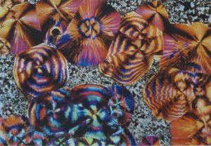
The Autochrome

Part of a steroscope Autochrome by Leonid Andreyev
This Autochrome essay was my final essay on my HNC Photography Course – I gained a Distinction for the whole course, which entailed gaining a Distinction on each of ten modules.
In the context of this Autochrome essay what do we understand ‘colour photography’ to encompass?
- Does it refer to a transparent image that can’t be duplicated or printed and can only be viewed by projection or with special viewers
- Does it refer only to a physical colour print that we can hold in our hands, that can be duplicated, enlarged and be viewed by many people at one time?
Photography has often been described as the pencil of nature and its direct translation means drawing with light. Sir Issac Newton discovered that light is made up of the colours of the spectrum, so one could draw the inference that any technology that worked with light might and should include colour.
Today’s colour photography
We are now able to produce both colour transparency images which can be duplicated, printed and projected at a larger scale than anything available at the turn of the twentieth century. We can also produce brightly coloured images on paper at a variety of scales on different stocks, so I would suggest that ‘colour photography’ can include both transparency and paper prints.
When the first photographs hit the public arena in 1839, they were monochrome tones rather than natural colours, disappointing many.
‘How could a process that captured the forms of nature with such exquisite detail, fail so dismally to record its colours2?’
And so ‘the race was on for colour3‘.
Early attempts
An initial response was to hand colour prints and some portrait painters, struggling to survive after the invention and rise of photography, learnt how to add colour to daguerreotypes. While this produced a pleasant effect, it very much depended on the skill of the retouch artist and was time-consuming and not cost effective.
One early colour attempt was made in 1840 by Sir John Herschel who was able to register colours on paper with light-sensitive silver chloride, but was not able to fix them and eventually they darkened. However, he was able to bring colour, albeit one colour, into a photographic image with his invention of the cyanotype in 1842.
The cyanotype
This was based on a blue pigment called Prussian Blue, which was used by painters and is what we know now as a ‘blueprint’. Other ways that photographers introduced colour into their images was through the use of different coloured printing stock. These were called Autotype Pigment Papers and they were actually carbon tissues, used by amateur and professional alike. Apparently, the company is so popular it is still operating today.
First successful experiment
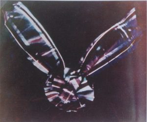
James Clerk Maxwell’ additive first colour attempt – a tartan ribbon – print of this was created by the Vivex process in the 1930s
The first relatively successful ‘additive’ colour experiment was that of James Clerk Maxwell who, using black and white negatives shot through respective red, green and blue filters, produced a famous image of a tartan ribbon and rosette.
This produced a recognisable colour image. However ‘the difficulties of achieving the much-desired colour on paper by the additive process4’, meant that a print was not produced from the negatives until the 1930s by the Vivex process.
Other attempts to create permanent colour images
Other processes that were attempted included:
- a filter colour line screen process invented by Joly
- a mosaic screen created by McDonough
- a one-shot colour camera using triple negatives called Heliochromy.
- In 1869 Du Hauron demonstrated ‘subtractive’ photographs on paper, but due to the insensitivity of the materials of the period, the colour balance was incorrect.
- F. E. Ives created an additive system called Kromskop similar to Maxwell’s process which exposed three separate black and white negatives on a single plate through blue/violet, green and red filters. Three glass positives were made through contact printing, cut and then viewed through the Kromskop viewer. Again the image would prove extremely difficult to print on paper.
- Gabriel Jonas Lippman’s direct interference system. This was neither additive or subtractive, but worked through the creation of interference patterns between light waves. This process used mercury to reflect light into the photographic emulsion, similar to our modern hologram technique.
Inspiring the Lumière brothers
McDonough’s earlier mosaic screen provided the impetus and inspiration for the Lumière brothers’ offering, a process that would stun the photographic community, sweeping the world with ‘colour fever5’. This process was the Autochrome process.
The Autochrome process
The Lumières were already involved in the photographic world, making strides in cinematography and creating ‘an easy to use, affordable “dry” black and white plate called ‘Etiquetter Bleue’6’. This proved very successful and provided enough finance for them to explore and experiment with colour photography, a quest which lasted 14 years. The company eventually became the largest photographic manufacturer in Europe.
Another use for ‘the Humble Potato’
Microscopic grains of starch from the ‘Humble Potato’ were used to create a mosaic screen on a glass plate. The grains were dyed three different colours: blue/violet, vermilion/orange and green and then mixed together in roughly equal proportions.
They were then spread extremely thinly on a glass plate that had been spread with varnish. The tiny spaces between the grains were filled with carbon black.
The new and more sensitive fine-grained, panchromatic silver bromide emulsion was spread over the whole plate. Finally, the plate was subjected to a very high pressure to ensure that the grains became very thin and transparent.
Exposing the new photographic plate
To expose the plate it was placed in the camera with the emulsion furthest away from the lens (the opposite way to how plates were normally exposed). Light then passed through the colour mosaic screen before registering on the emulsion.
A yellow filter was placed over the camera lens to balance the over blue sensitivity of the plate. Processing entailed developing the negative image, removal of the developed silver, then the development of the residual positive image. The actual development itself in total darkness was difficult for photographers used to black and white printing.
Untitled, Rudolf Dūhrkoop
Some drawbacks of the new process
- Plates were a lot slower than the black and white plates, as filling the gaps between the grains ‘reduced the effective speed of the plate7’.
- Subjects had to remain still for at least a second, taking photography back to its early days of rigid poses and no movement.
- Photographers had to become much more conscious of elements and colours within a possible image, selecting and rejecting items to become part of the composition, and staging images rather than allowing the action to occur naturally.
- Often the starch grains would clump together showing particularly in large areas of colour such as skies, although on a positive note it did help create the very ‘dreamy’ quality of the process.
- Plates were very fragile meaning that many did not survive.
- The process produced a positive transparency which at that point in time was unable to be duplicated or direct colour prints made from it.
- Difficult for large numbers of people to view the transparencies at the same time, making exhibition problematic.
- Professional photographers such as Stieglitz, Steichen and other Pictorialists and Photo-Secessionists felt the process allowed little leeway for artistic ‘tweaking’ (unlike black and white photography), giving ‘the operator no right to call himself their creator8’.
- This was one of the main reasons why many eventually stopped using the process, including Stieglitz, whose enthusiasm ‘would last only about a year9’. The only way creative input was possible was during the development process, which Steichen became proficient at.
- Cost was also an issue, with plates being supplied in boxes of four rather than the usual twelve as they were so expensive to produce.
- Exposure. No consistency in the sensitivity of the plate which made it difficult to judge the exposure time. This was improved later in the life of the autochrome process.
The positive aspects
- It produced ‘luminous and lush10’, ‘distinctive colour quality11’, with an ‘unreal shimmering Impressionist colour cast and an atmospheric depth12’.
- It produced Autochromes that were ‘lyrical and evocative13’ with ‘inherent luminous beauty and dream-like quality14’. This appealed to both the professional and hobbyist alike.
- The autochrome didn’t require any specialist equipment, it made it very popular with the hobbyist photographer, much to the dismay of the professionals who were concerned that amateurs would produce ‘the most appalling fried-egg results15’.
- The process handled red extremely well, creating a rich, romantic warmth in the red tones (but sometimes had problems portraying a correct blue and sometimes yellow). Many photographers took advantage of this trait and often used models who had rich red and auburn hair or introduced red elements such as shawls and parasols to increase the impact of colour in the images.
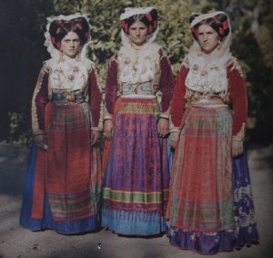
Women in Cofu, Auguste Léon – ladies in their national dress, showcasing how the Autochrome process enhanced the reds of their outfits
The launch
The launch was greeted rapturously and ‘many photographers were bewitched by the twin spells of depth and colour17’. Both Stieglitz and Steichen had been lucky enough to be in Paris when the Lumières launched the Autochrome and Stieglitz returned to America, declaring in a press release that ‘Colour Photography is an accomplished fact18’. He equated:
‘the marvels of “macronigraphing” (wireless telegraphy)…… to “looking at these unbelievable color photographs! … The Lumière process, imperfect as some may consider it, has actually brought color photography in to our homes for the first time, and in a beautifully ingenious, quick, and direct way19’ and he felt ‘the invention….. equaled that of photography itself in its importance20’.
Stieglitz prophesied:
“The possibilities of the process seem to be unlimited. Soon the world will be colour-mad – and Lumière will be responsible”21.
Other photographers
- Personnaz in France encouraged his contemporaries ‘not to leave it solely to our foreign colleagues to take advantage of this new progress in the very French art of photography22’.
- Steichen took plates to England and showed them to George Bernard Shaw, who ‘autochromed’ Alvin Langdon Coburn
- Coburn who ‘autochromed’ Shaw, actually travelled to Paris to get his own supply as they weren’t yet available on the British market.
- Steichen ‘though more taken than anyone with the latest vehicle of colour vision, kept his balance better than most…’ produced both larger and smaller plates and offered his autochromes at a wide range of prices23’.
- Newspapers printed several articles on colour photography
- Society of Colour Photography was established in London.

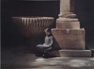
Untitled (Woman Posing in a Garden) Paul Bergon
Public exhibition
Despite the problems of public exhibition almost 100 autochromes appeared in the Salon Exhibition of 1908 (viewed against backlight, projected or viewed through diascopes), by figures such as Steichen de Meyer, Langdon Coburn and Annan.
‘many amateur photographers eagerly embraced the world of colour that was now finally, within their grasp24’.
Albert Kahn – banker and philanthropist
French banker and philanthropist Albert Kahn was also very excited by the possibilities of the Autochrome and ‘realised that photography was standing at the threshold of a new world of creative possibilities’25. He envisaged that it could be the ‘instrument that would help him achieve a cherished political ambition’26, to create world peace and promote international understanding through people experiencing the different cultures of the world.
Kahn’s Archive of the Planet – world peace through the Autochrome
Kahn considered the Autochrome to be an educational tool to broaden the mind through travel and set up a scholarship to allow teachers to visit various countries. He also ‘bankrolled’27 one of the most significant photographic archives in the world, his Archive of the Planet, now housed at the Musée de Albert-Kahn, France.
In 1908 he acquired his first autochrome plates and the images created were shot by his chauffeur Alfred Dutertre on a ’round the world’ tour that the pair undertook, thought to be the first known colour images of the respective countries that they visited.
Over the next twenty-two years, he sent photographers and cameramen all over the world, capturing film and still images, in colour and black and white. His photographers ‘recorded in intimate detail the lived experiences and cultural practices of thousands of ordinary people from across the globe28’ and immortalising the cultures at a time when often they were undergoing major political and social changes and upheaval.
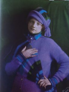
Kitty Steiglitz, Alfred Steiglitz
What Kahn photographed
They travelled to the Western Front during World War 1, changing forever our black and white perception of the horror of the trenches. They chronicled the dying Gaelic villages of the Claddagh in Ireland, the mourning in Japan for the death of the Emperor and the changing face of the Middle East, Africa, Asia and Scandinavia.
Thanks to Kahn’s opérateurs we are introduced to the notables of the period, in glorious colour. Ramsay McDonald, Sir Austen Chamberlain, King Alexander 1 of Yugoslavia and the sculptor Auguste Rodin are all immortalised in autochrome plates.
Effects of the Wall Street Crash on Kahn & the Archive
Eventually, Kahn owned his own bank and probably thought he would be able to continue to finance the archive indefinitely. However the financial crisis of the Wall Street crash of 1929 ‘reduced one of the most successful bankers in Europe to something approaching penury29’ and by the mid-1930s he was bankrupt.
He sold his Boulogne estate to the local authority, but they allowed him to continue living there (it later became the Museum that housed the archive). The Archive survived the war, narrowly avoiding being stolen or destroyed when the Nazis invaded and now provides us with an amazing window on a time of change and social and cultural upheaval throughout the world and an Autochromic legacy of over 72,000 images.
Other uses for the Autochrome
As well as portraiture and historical and cultural documentation it was, like any new technology, used for pornography and nude studies due to its delicate handling of skin tones. Autochromes were also used as an educational tool (in the true sense, not Kahn’s sense).
A macro autochrome
Gervais Courtellement (one of Kahn’s Archive photographers) gave popular, illustrated lectures of his Oriental travels and opened a Palais de l’Autochrome which exhibited his war photos.
Aubert, one of Courtellement’s colleagues produced gory images when he worked in the war hospitals and some autochromes were used to document and examine various diseases, wounds and deformities, projected in lectures and in stereoscopes.
This provided a new way to share information with other hospitals and doctors. Dr Friedrich Paneth a chemistry lecturer and director of the Max Planck Institute for Chemistry in Mainz, was also an avid photographer and used autochromes in his lectures, projecting the Periodic Table from autochromes.
Book illustrations
Occasionally autochromes were also used to illustrate books if the publication had the finances to support the required separation to colour printing (not photographic printing). One such book the author of this essay discovered was The Adventures of Jack Rabbit by Richard Kearton, published by Cassell in 1911, which has six delicate autochromes reproduced in colour, showing a variety of woodland flowers, butterflies and moths, and bird’s eggs.
Vault of San Zeno de Maggiore, Fernand Colville, Archive of the Planet
After the initial excitment
After the initial excitement following the introduction of colour, photographers such as Stieglitz reduced their use of the autochrome because of the ‘lingering impracticalities30’of the process.
According to Natalie Bouloch, author of Autochromes and Pictorialism (in Impressionist Camera, Pictorial Photography in Europe, 1888-1918) Stieglitz et al, ‘deeply attached as they were to the idealistic doctrine of interpretation31’ came to the conclusion that autochromes were ‘mere slaves to reality32’ and came to see the autochrome ‘as part of a regressive movement33’.
Sales increased
Despite the limitations of the process and despite a ‘latent desire for colour photographs on paper34’, production and general sales increased. The British Journal of Photography at the time commented that ‘the demand in France has been so great that there has been no chance of any plates reaching England yet, but as the makers are doubling their output every three weeks it will not be long before plates can be obtained commercially in England35’.
Many photographers stockpiled plates, especially after the break in supply during World War 1 and Albert Kahn is thought to have purchased 1% of the total 20,000, 000 Lumière production and the process ‘dominated the market for colour photography for nearly 30 years36’.
Decline of the Autochrome
Endeavouring to resolve the issue of the fragility of the medium, in 1932 Lumière introduced the Autochrome on a film stock and marketed it under the name of Filmcolour and within two years it had almost totally replaced glass. However, these improvements failed to save the autochrome.
Competitors
Other manufacturers such as Kodak and Agfa were developing ‘new multi-layer colour films through subtractive synthesis – thus doing away with the need for filter screens37’. In 1935 Kodachrome was announced in the Rochester Evening Journal, as ‘the first commercially viable colour film38’ and it was described as ‘a momentous day in the history of colour photography39’. In 1938 National Geographic magazine used only sixty-two Kodachrome images, by the following year that had increased to three hundred and seven.
Very shortly after that, they decided to use Kodachrome exclusively both as 35mm and sheet cut film. In 1936 Agfa patented a method of producing colour couplers that ‘stayed put40’ in an emulsion layer and they were able to bring to the market a multilayer reversal film which they called ‘Neu’. It was also 35mm and slightly slower than Kodachrome.
And so the era of the autochrome was over.
End of an era
The process that promised so much and excited so many photographers, that had made such an invaluable contribution to the history of the photographic story, but which for some had failed to fulfil that promise, ceased to be a viable, commercial medium.
The question in respect of this essay, is whether it satisfied the quest of the photography community for the ‘Holy Grail’ of easy to use, commercially viable colour photography?
Was it inclusive?
Firstly one can ask whether the process allowed all members of the photographic community to produce colour images. The fact that all photographers could use their existing equipment, without having to buy bulky and pricey ‘add-ons’ would suggest that the autochrome was egalitarian enough to meet this first requirement.
Was it recognisable and permanent?
Secondly was the colour produced by the autochrome process recognisable and permanent? Unlike previous attempts to produce colour, the autochrome colours were rich, atmospheric and permanent (lasting, we now know over 100 years).
Although there were some issues with colour sensitivity and speed, these were addressed either through the use of filters or improved as the process was refined during manufacture. This suggests that the autochrome fulfilled the second requirement of colour photography.
Was it easy to view?
Next, was the process easy to handle and view? At first, the plates were very fragile, leading to many breakages and wastage, but this was later improved by using a film stock. Viewing and exhibition were problematic, requiring as it did, the use of projection or diascopes to make the most of the warmth of tones and the luminous quality inherent in the process. In this respect, the autochrome was not so successful and so it doesn’t fulfil the requirements fully.
Was it competitively priced?
As with any commercial product, price is always an issue. When they were first released onto the market plates were sold in boxes of four, rather than the usual twelve. This suggests that they were much more expensive than black and white plates and some photographers, after the initial excitement had died down, stopped using them for this reason. However, they fulfilled a ‘need’ in the photographic community, that of a viable colour medium and many used them despite the price. So I would suggest that on this point the autochrome fulfilled the requirement of commerciality.
Did they offer creative potential?
Black and white photography had allowed many photographers to ‘tweak’ and manipulate their work to create fine art and aesthetic images, not just direct reproductions of nature and people. Many professionals had hoped that the introduction of colour photography would allow them the same leeway, but unfortunately, they were to be disappointed, with only a few such as Steichen developing enough skill to manipulate the image during processing to satisfy his artistic desires.
Should this suggest that the autochrome was unsuccessful, just because a select few were disappointed? The fact that it allowed amateurs to produce colour images, which had previously been beyond their reach, suggests that in fact, it was extremely successful with general photographers.
Conclusion

Nanny Mary Warner with Lotte and Hans Kūhn – Heinrich Kūhn
Overall the autochrome process produced beautiful, atmospheric images of a period of great social and cultural change. It failed to fulfil the latent desire for prints, but proved to be an invaluable step in photographic history towards colour photography as we know it today, …
…..especially digital photography which uses Bayer technology, a mosaic colour filter system similar to the autochrome.
To view examples of Nicola’s colour photography click here
To discuss your photographic needs call 0775 341 3005 or email info @ iconiccreative.co.uk
Footnotes:
1 Autochrome: the Dawn of Colour Photography, National Media Museum, pg 1. (Article in Appendices). / A Century of Colour Photography from the Autochrome to the Digital Age, Roberts, Pamela, pg 25.
2 Autochromes: the Dawn of Colour Photography, National Media Museum, pg 1.
3 A Century of Colour Photography, Roberts, Pamela, pg 12
4 A Century of Colour Photography, Roberts, Pamela, pg 15
5 The Autochrome: 100 Years of Color Photography, Antman, Mark. Article reprinted from The Picture Professional, Issue 2, 2007 (Article in Appendices). Quote from Alvin Langdon Coburn in a letter to Alfred Steiglitz, pg4 of article.
6 The Autochrome: 100 Years of Color Photography, Antman, Mark. Article reprinted from The Picture Professional, Issue 2, 2007 (Article in Appendices), pg1
7 The Illustrated History of Colour Photography, Coote, Jack, pg40.
8 Autochromes by Clarence H. White, Nickel, Douglas R., Record of the Art Museum, Princeton University, Vol 51, No2, The Art of Pictorial Photography 1890-1925, pg2. (Article in Appendices).
9 The New Colour Photography – A Bit of History, Steiglitz on Photography, Steiglitz, Alfred, pg 208. (Article in Appendices).
10, 11, 12 A Century of Colour Photography, Roberts, Pamela, pg 24.
13 The Autochrome: 100 Years of Color Photography, Antman, Mark. Article reprinted from The Picture Professional, Issue 2, 2007 (Article in Appendices), pg1. (Article in Appendices).
14 Autochromes: The Dawn of Colour Photography, National Media Museum, pg2. (Article in Appendices).
15 Autochromes by Clarence H. White, Nickel, Douglas R., Record of the Art Museum, Princeton University, Vol 51, No2, The Art of Pictorial Photography 1890-1925, pg2. (Article in Appendices).
16 The Autochrome: 100 Years of Color Photography, Antman, Mark. Article reprinted from The Picture Professional, Issue 2, 2007 (Article in Appendices), pg1. (Article in Appendices).
17 Autochromes: The Dawn of Colour Photography, National Media Museum, pg3. (Article in Appendices).
18 Stieglitz A Beginning Light, Hoffman, Katherine, pg 243. Quoted from the original Press Released reproduced in the book.
19 Stieglitz A Beginning Light, Hoffman, Katherine, pg 243. Quoted by Hoffman from Stieglitz, 1907b, pp. 24, 25.
20 Autochromes by Clarence H White, Nickel, Douglas R., pg 1. (Article in Appendices).
21 The Wonderful World of Albert Kahn, Okuefuna, David, pg 9.
22 Impressionist Camera, Pictorial Photography in Europe, 1888-1918, Saint Louis Art Museum, pg 270. Quoted from A propos des autochromes, Bulletin de la Société Française de Photograhie no 18, 1908, p.378.
23 Edward Steichen: The Early Years, Metropolitan Museum of Art, pg 32.
24 Autochromes: The Dawn of Colour Photography, National Media Museum, pg 4. (Article in Appendices).
25, 26, 27 The Wonderful World of Albert Kahn, Okuefuna, David, pg 12-13.
28 The Wonderful World of Albert Kahn, Okuefuna, David, pg 12-13.
29 The Wonderful World of Albert Kahn, Okuefuna, David, pg 15.
30 Edward Steichen: The Early Years, Metropolitan Museum of Art, pg 32.
31, 32, 33 Impressionist Camera, Pictorial Photography in Europe, 1888-1918, pg 272.
34 The Illustrated History of Colour Photography, Coote, Jack H, pg 71.
35 The Illustrated History of Colour Photography, Coote, Jack H, pg 41.
36 Autochromes: The Dawn of Colour Photography, National Media Museum, pg 4.
37 Autochromes: The Dawn of Colour Photography, National media Museum, pg 4.
38 http://www.dailykos.com/storyonly/2006/12/7/04913/9030/204/278472
39 The Illustrated History of Colour Photography, Coote, Jack H, pg 141.
40 The Illustrated History of Colour Photography, Coote, Jack H, pg 152.
Reference
Hoffman, Katherine, Steiglitz, A Beginning Light, Yale University Press, New Haven and London.
Saint Louis Art Museum (essays by various authors), Impressionist Camera, Pictorial Photography in Europe, 1888-1918, Merrell, London and New York.
Coote, Jack H, The Illustrated History of Colour Photography, Fountain Press.
Nickel, Douglas R., Autochromes by Clarence H. White, Record of the Art Museum, Princeton University, Vol. 51. No. 2, the Art of Pictorial Photography 1890-1925, pp. 31-37, Princeton University Art Museum (article printed in Appendices).
National Media Museum, Autochromes: The Dawn of Colour Photography, National Media Museum (article printed in Appendices).
Steiglitz, Alfred, Steiglitz on Photography, Chapter: The New Colour Photography – A Bit of History, Aperture (article printed in Appendices).
Antman, Mark, The Autochrome: 100 Years of Color Photography, Reprinted from The Picture Professional, Issue 2, 2007 (article printed in Appendices).
Okuefuna, David, The Wonderful World of Albert Kahn, Colour Photographs from a Lost Age, BBC Books
http://www.dailykos.com/storyonly/2006/12/7/04913/9030/204/278472
Bibliography
Books and articles
Metropolitan Museum of Art, Edward Steichen, the Early Years, Metropolitan Museum of Art.
Marien, Mary Warner, Photography A Cultural History, Laurence King Publishing.
National Media Museum, Alternative Photographic Resources, National Media Museum.
Friedman, J.S., History of Color Photography, Focus Press.
Roberts, Pamela, A Century of Colour Photography from the autochrome to the digital age, Andre Deutsche (article printed in Appendices).
Johnson, Frances Benjamin, An American Century of Photography, Hallmark
Online sources
http://www.photographymuseum.com/potatoestopictures.html
http://www.nationalmediamuseum.org.uk/autochrome/Notable_Photographers_detail.asp?PhotographersID=9
http://www.institut-lumiere.org/english/lumiere/autochrome.html
http://www.nationalmediamuseum.org.uk/autochrome/Colour_Development.asp
http://www.notesonphotographs.eastmanhouse.org/index.php?title=Osterman,_Mark._%22The_Autochrome_Process%22
http://users.telenet.be/autochromes/introduction.htm
http://www.luminous-lint.com/app/vexhibit/_THEME_Autochromes_Travel_01/2/0/0/
http://blog.photoshelter.com/2008/07/george-eastman-house-and-the-autochromes.html
http://blog.gettyimages.com/tag/autochromes/
http://www.smithsonianmag.com/arts-culture/autochromes.html
http://photography.nationalgeographic.com/photography/photographers/first-natural-color-photo.html
http://www.photographymuseum.com/autochromeclatworthy.html
DVDS
The Twenties in Colour: The Wonderful World of Albert Kahn, The End of a World, BBC4 Thursday 29th November 2007
Edwardians in Colour: The Wonderful World of Albert Kahn: Northern Exposure, BBC2 Friday 23rd November 2007

3 Typography Tips to improve your design projects
Typography is a key element of design. Having worked as a designer for the last 20 years, I’m always ‘reviewing’ peoples’ material subconsciously.
There are 3 typography mistakes that jump out at me every time:
1 – Widows and orphans
2 – Hyphenation
3 – 2 spaces or not 2 spaces

Typography errors showing widows, orphans and inappropriate hyphenation
1 – Widows and orphans
A ‘Widow‘ in typography is a line of text from a paragraph that either sits at the bottom of a column with the rest of the paragraph starting at the top of the next column. Or a single line from the end of a paragraph that has flowed on to the top of the next column on it’s own.
An ‘Orphan‘ is a single word, or hyphenated part of a word that is left at the bottom of a paragraph. This to me is a dead give away that whoever created the piece of material hasn’t had any design training.
How to solve this issue:
Keep your layouts regularly and reflow ‘widows‘ and ‘orphans’ if you can, to get them together in one paragraph. What I do with ‘orphans’ is use what is known as a ‘soft return‘. Normally when you do a paragraph return on a computer to create a new paragraph, this creates what is known as a ‘hard return‘. If you turn on ‘the invisibles‘, the invisible characters that show spaces and returns, in Word and other processing programmes you can see what a ‘hard return‘ looks like.
Soft return
A ‘soft return‘ keeps the word/s following as part of the original paragraph and doesn’t make a new paragraph. To make a ‘soft return‘, hold down the the Shift key as you’re pressing the paragraph return key.
To get rid of an ‘orphan‘, I will read back through a paragraph. I move small words down the paragraph by using a ‘soft return‘ at the end of each line. Eeventually another word, or two/three will drop onto the last line of the paragraph where the orphan is. You no longer have an ‘orphan‘ and your paragraph looks much more professional.
You can use a ‘soft return‘ on ‘widows‘ as well. Review your paragraph to see if there is another line or two that can be brought onto another line using a ‘soft return‘. Are you able to make two lines rather than just a ‘widow‘ at the top of the new paragraph?
Using a ‘soft return‘ will help you make your typography much cleaner and tidier, as well as looking more professional.
2 – Hyphenation
Another very obvious sign that someone has little experience in typography is that of inappropriate hyphenation. Sometimes a word won’t fit in at the end of a line and so the automatic hyphenation in the programme kicks in and breaks the word.
From a designer’s point of view, this looks incredibly ugly.
How to solve this issue:
The easiest way to solve this, is to go into the programme type controls and turn off ‘automatic hyphenation‘. This means that any word that doesn’t fit at the end of a paragraph will drop to the next line. The only hyphenation will be where a manual hyphen has been used.
3 – 2 spaces or not 2 spaces
This one is often the most contentious. I’ve seen, and taken part in, long ‘discussions’ on various forums as to the rights and wrongs of 2 spaces after a full stop.
Origins of 2 spaces
In the days of manual typewriters, it was standard practice to add 2 spaces after a full stop. This apparently had to do with the spacing of different physical characters, to make it easier for people to read the copy.
One space
Now a days, with computer typesetting and design, fonts are designed specifically with spacing in mind, so it is no longer necessary to add 2 spaces to your copy.
As a designer, it is standard practice when laying out client copy, to remove all double spaces from the text. This makes the text flow better. Even if you put them in when you supply your copy, your designer will most likely strip them out, to make your design look better.
I hope you’ve found these 3 tips helpful. To learn more about design and typography check out some of my other blog posts:
’13 key steps in the design process’ in this blog
“Understanding designer speak’” in this blog
‘The benefits of using good design’ in this blog
‘What your designer needs from you’ in this blog
To see more examples of the extensive design work I’ve carried out for my clients visit the Design page of www.iconiccreative.co.uk.
To discuss your design requirements email me at info @ iconiccreative.co.uk or call 0775 341 3005.

Better Photography 101 – Part 2 – Camera tools
Camera tools (for DSLR)
 All DSLR cameras have tools which allow YOU to choose determine how you create your image. YOU are in control. By changing each tool, YOU can change how YOUR final image looks.
ISO – this is the sensitivity of the film (ASA in the ‘old days’) and now the sensor in digital cameras

Camera settings

Camera settings ISO/ASA
Use different values for this depending on the light conditions ie if it is bright sunlight set the ISO to 100 (and close the aperture to f22 – ‘stop down’), but if you’re shooting inside or on a darker day increase the ISO to 800 or above so that you capture more light. There are drawbacks however. The larger the ISO number the more ‘noise’ is introduced into the image.
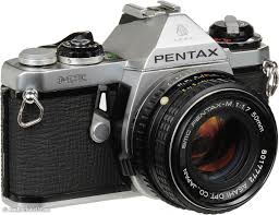
The close up of this old film camera shows 200 ASA. It would change depending on what film you put in the camera. Digital cameras allow you to change the ISO to suit the conditions, but they still relate to how film sensitivity worked. 100 ISO is used in bright light and in studio flash situations. 200-400 ISO in more over cast situations. Higher ISOs such as 1600, 3200, can be used in really dark conditions, but create more ‘noise’.

Light is one of the main tools of photography
Light – what is available to you: natural light, sun light, ambient lighting, or photographic lights
Photography translates as drawing with light, so light is a key tool. By knowing how to control light you can really improve your photos
Natural light is the main one that most people would use. On a sunny day the light can be very harsh, with strong directional shadows. Even these out by using an extra light source in the form of a flash or a reflector. These don’t always have to be expensive, sometimes a sheet of white paper, or a white sheet can be used. Even a white wall can act as a reflector.

The aperture allows you control how much light enters the camera
Aperture/F stop – This tool is the lens opening on your camera that lets light through onto the film or the digital sensor. YOU can change it to allow different amounts of light through.
An open aperture lets in lots of light, a smaller aperture lets in less light. This is also a way of creating depth of field. A large aperture creates a soft, out of focus effect. If you focus on a foreground image, the background will go out of focus.
To create a sharp area through more of your image, use a smaller aperture (larger f/stop number).

Slow shutter speed with an f22 aperture
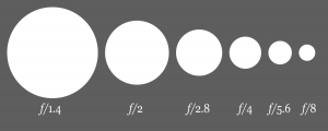
Aperture chart – the larger the number, the smaller the hole
F/stops range from f1.4 through to f22. Combining a slow shutter speed (see above) with f22 creates lovely light flares.

A slow shutter speed can be used to create dreamlike water effects

A slow shutter speed can be used to create amazing light trails
Shutter speed – This is how fast the shutter moves and how long the sensor is exposed for.
A slow shutter speed exposes the sensor for a long time, a faster shutter speed exposes the sensor for a shorter time. This gives you a great tool to create fantastic effects.

Low light product shot

Night shot showing lights
Slow shutter speed
Using slower shutter speed is a great tool that lets you create dreamy waterfalls, or seascapes, stunning lights trails and amazing low light imagery and night photography. Use a tripod if the shutter speed drops below 1/125 to stop camera shake.
Fast shutter speed
A faster speed is a great tool to use to allow you to freeze motion. This is good for sports photography and other instances where the image content needs to be sharp.


Each tool affects the other. Knowing how to balance and manipulate them to create amazing images takes practise and can really improve your photography.
Learn why cropping your photos is a great way to improve them.
Check out part 1 of the Better Photography 101 series about your intent behind your photos
Check out some of my previous work at www.iconiccreative.co.uk
To find out how I can help you create atmospheric portraits, or event coverage, call me on 0775 341 3005 or email info@iconiccreative.co.uk

Better Photography 101 – Part 1 Intent – Take better photos
Have you ever wished that you could take better photos?
This series of ‘better photography 101’ blogs will help you improve your skills
Basic composition and lighting principles can vastly improve the quality and impact of your photos, whatever your camera.
Pentax
Facebook and Instagram Stories, and Storytelling have become very important in raising your profile. Improving your photos, to give your images more impact makes sense.
“It’s not the camera but who’s behind the camera.”
Create better photos – create meaningful images – find your voice.
Here are a few basic tips that will help you improve your skills and help you create better images.

This photo was taken in Paris at the open air Martin Parr exhibition. I waited for ages until I saw someone start using their mobile phone (the lady in purple) next to Martin Parr’s photo of people on phones. She wasn’t quite as close as I’d hoped though.
Better photos – Your intent
List all the things you like about photography, why you like taking photos, what message or story do you want the world to hear?
Do you have a cause you’re passionate about and want to highlight? Are you happy just to capture family parties and events for posterity?
Do you take photos of your kids’ sports events? Or are you captivated by the natural world?
Snaps and selfies have their place, but even they can be vastly improved by learning some photographic techniques and considering the message you’re trying to convey.
Bring out your inner artist and find your Voice. Do a google search for famous photographers for inspiration, or look on Pinterest or Instagram for ideas.

Taken in India in Mandawa in India.
Exercises for better photos
- Take a photo a day for a month, don’t think about it just do it. At the end of the month review your images. What themes have started to emerge? What did you like photographing the most?
- This one is very interesting to do. Take your camera and 2 dice out for a walk. Roll the dice and walk the number of steps the dice say. Roll the dice again and take the number of photos the dice tell you, but think about what you want to say about what you’re photographing. Use position, angle, distance from your subject and so on.
You’ll be surprised at what images you can create. To vary it, use more dice.
I once did a variation of this exercise and ended up under a very boring railway bridge, having to take 10 photos in the one spot. I had to think very creatively to get interesting shots that said something.


Learn why cropping your photos is a great way to improve them.
Nervous about your photoshoot? Check out my blog giving tips to make you feel more comfortable.
Check out some of my previous work at www.iconiccreative.co.uk
To find out how I can help you create atmospheric portraits, or event coverage, call me on 0775 341 3005 or email info@iconiccreative.co.uk

The benefits of using good design
The benefits of good design for your brand, your products and services are sometimes difficult to quantify, especially when you’re thinking about starting or rebranding a business.

Star Wars exhibition panel
Used as a strategic and emotional tool, good design can help a business communicate effectively with its customers, whilst meeting their needs and delivering quality products and services.
Here’s a list of some of the other benefits investing in good design can bring to a business:
New brand for Vieri
• It builds a stronger identity for your brand and business
We are surrounded and bombarded daily by imagery all competing for our attention. Each person had roughly 100 brands that have relevance daily to their life. For instance supermarkets, clothing, money services and so on. Spending money on developing a quality brand, helps a company stand out and hopefully become a ‘go to’ brand.
• Simplifies and clarifies your message
Companies come in all shapes and sizes with messages for all sorts of potential customers, so to stand out from the crowd and from the general noise, using good design helps to simplify and clarify your message.
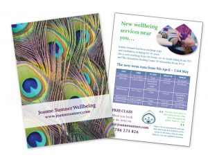
Joanne Sumner Wellbeing leaflet
• It helps increase sales and differentiates you from your competion
The more customers and clients see your brand, the more it affects their perception of your company. In a situation where two companies offering equal or similar services or products, they are more likely to remember you and more likely to purchase your services, thus increasing your sales.
• It helps increase the value of your venue, products and services
By investing in good design, as well as a rise in sales, it helps raise customer perception of your company, helping you stand out from your competition and helping increase the perceived value of your products, making them more valuable. Customers are often prepared to pay more for products or services that look better, work better and are more sustainable.
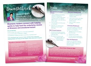
Dawn Petherick leaflet
• It helps increases visitor numbers
As with helping to raise sales and the value of your offering, good design helps increase your visitor numbers if you are a venue such as a museum, event or heritage company. Signage at these locations benefits immensely from good design, allowing customers to find their way around the venue more easily.
• Helps customers remember your venue, product or service and improves your market position
Think of a popular cola drink and what is the main one that comes to mind? With it’s red colour and iconic typography Coca Cola is recognised around the world. Good design can help you create and improve customer recognition and gain more significance for your products, through regular exposure.
• It helps boost customer loyalty – creates goodwill and trust
Using good design to improve your brand look and feel helps to raise your company profile, making you more visible. This helps raise peoples’ perception of the company as well as trust and goodwill. Supported by great customer service, it can help boost customer loyalty. By solving your customers’ needs good design helps reduce customer dissatisfaction.
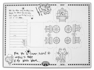
Worzel colouring sheet for Harvester
• It boosts staff loyalty
Good design isn’t just about creating a great logo, brand or collateral. By creating environments that work well for and look after staff, good design helps improve staff loyalty, as well as customer loyalty.
• It helps reduce costs
By reviewing your business and brand, revamping and implementing a new look or a new system, you can save money. Ensuring that your brand collateral (digital or print) is clear and easy to read, allows customers to find answers to their questions and helps companies cut down on helpline requirements, staff costs and so on.
• Grabs and keeps attention
Well designed products and services capture potential customer attention and supported by captivating point of sale materials are even more attractive. This helps your company/brand stand out in a competitive market.
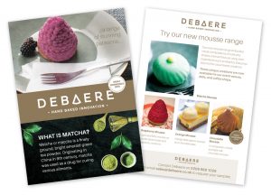
Debeare patisserie leaflet
• Create more products and open up new markets, or bring new products to market more quickly
Creating a well designed brand that customers recognise and trust, allows you to launch new products and services more quickly, and can even open up new markets.
Check out the ’13 key steps in the design process’ in this blog
Or read about “Understanding designer speak’” in this blog
To see more examples of the extensive design work I’ve carried out for my clients visit the Design page of www.iconiccreative.co.uk.
To discuss your design requirements email me at info @ iconiccreative.co.uk or call 0775 341 3005.

What your designer needs from you
Once you’ve chosen your designer for your next project, you need to know what your designer needs from you.
Every project is different, but the basic requirements will be the same. Usually a designer will supply a briefing document they will ask you to fill in to gain a clearer idea about this.
-
What type of product is it?
The first thing your designer needs to know is the type of product the project is. Is it a D/S (double sided) leaflet? A roller banner? Is it a catalogue or magazine? Or something else?
-
What size is it?

Paper folds in a leaflet
The next thing your designer needs to know is the size: is it A4, A5, A0 or a custom size? Most projects use the standard A Paper Sizes, such as A5, A4 or DL (1/3 A4).
Others can be custom sizes: ie a client may need exhibition panels for the shell display units in an Expo. These aren’t standard sizes and so your designer will need the specification from the exhibition organiser.
Or, you may want your designer to create a custom pack for your new jewellery product, or a label to go on the pack. They can either create that totally from scratch after measuring your product, or, if you’ve researched packaging manufacturers of specialised packaging, the manufacturer needs to supply you and your designer with a pack template.
-
What is the product for?
Is the product going to be used to advertise an event, or a service? Does it showcase a product range? Is it for an exhibition? Is it a giveaway/freebie/lead magnet to raise your profile? Knowing this helps your designer create the product with your end goal in mind.
-
Do you have an overall feel you would like the project to have?
Knowing the overall feel that you want to create is also helpful for your designer. It gives them more information to work with visually. For instance if you’re a more corporate company, you might want the item to have a more serious, corporate feel to it, whereas if you’re a family services provider, you would want a bright, fun, friendly feel to the product.
Or, you might want to shake things up a bit. I once designed a die cut, hand glued invite of a sporran, for an international property company, as a bit of fun, which the client loved.
-
Do you have brand colours?

Example of colours swatches
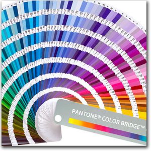
Pantone colour chart
This is a core requirement to sure that the final printed project is consistent with your brand. If the project is a printed project, your designer will need to know either your Pantone Colours or the CMYK colours. If you haven’t got those, you need to supply a sample swatch of a colour you want to use.
RGB is a screen format so those colours aren’t suitable for print. They need to be converted to CMYK to ensure they print properly. Sometimes, depending on which colour it is, the colour can go really flat when converted. This is because RGB is light and CMYK is pigment. Your designer will try and match it the closest they can.
-
If not what sort of colours would you like?
If the designer has no idea of your brand colours, or your colour preference, they will have to make a creative judgement call and use their own preferences based on experience. This may not be exactly what you want, so leads to miscommunication and more amends.
-
Do you have brand fonts?
Your designer needs to know the fonts you need
As with brand colours, the designer will need to know if you have specific brand fonts that you want to use. This again helps create brand consistency. If the fonts are very unusual, the designer may not have the actual font files available, so will need you to supply them.
If you don’t have the actual font files, but still require that that particular font needs to be used, the designer will either a) find a suitable version online and ask you to purchase it, or b) purchase it for you and add the cost to your invoice.
There are multiple font libraries available online, some paid and some offering free options.
-
What is your deadline?

Your designer needs to know your deadline
This is one of the key pieces of information your designer needs to know. They will work backwards from that date, working out how long it would take to print (allow a minimum of 5 days to be safe), time to stick labels on if you’re designing a label for cosmetics, time for proofs to go back and forwards between the designer and yourself, and any others who need to see it and so on.
I don’t know about other designers, but I work out the absolute latest date that a job can go to print, but I give my clients at least one day before as the final date. This gives us/me leeway in case something goes wrong ie a final mistake has been spotted, etc. Life happens and building in a safety margin is always a good thing.
-
What is the budget?

Knowing your budget helps your designer
Again, this is a critical piece of information. As with anything, the bigger the budget, the more flexibility it gives both you and your designer. A bigger budget allows your designer more time to: research trends and potential images, create more solutions for you to view and so on. It also allows them more creative scope.
As I mentioned above, I created a sporran invite for a property company – having a bigger budget allowed me to be more creative in my creative problem solving, thus creating a totally unique and unusual solution to their problem, rather than just a plain A5 invite.
Your designer also needs:
-
Final approved copy/text
Your designer needs final approved copy
This is a major bug bare for any designer. The number of times I’ve been asked to ‘just knock something up and I’ll get the text to you later”. This is like trying to design with one hand tied behind my back.
Ideally the designer should be given final approved copy/text. They can then design the item in one go with all the elements that will be needed, without having to add in placeholder text, or guessing what might be needed.
Using the final text also helps keep your costs low, as any amends you make are usually charged on top, once your 1st round of amends that most designers use, has been used up.
-
Images

Your designer needs suitable images
This is another area which can be problematic. Often images that are supplied are images which come from the company website. These are NOT suitable for print. They are far too small and won’t print well. You need to supply good quality large files: at least an MB in size (kb is tiny, mb is better, gb is huge).
Another issue that needs to be stressed is that of copyright. You need to use images that you either hold the copyright to, or the right to use. Taking a random image off the web and using it is theft, and leaves you open to potential law suits. Getty Images is particularly hot on this at the moment.
Don’t take the risk.
If you need images, there are plenty of image libraries available, both paid and free: Shutterstock, Getty Images, Pixabay, Pexels, Unsplash and for vectors Vecteezy is good too. Or, you can commission me to shoot images specific to your needs :-).
-
Logos

Iconic Creative peacock logo
The designer who designed your logo should have supplied you will suitable files for use both in print and online. These are usually in formats such as .ai (Illustrator), .psd, .eps, .jpeg, .png etc
The best ones for print are .ai, .psd, .eps and .jpeg (depending on size). .AI is a vector format which means it is good for icons and logos with clear edges, and can be enlarged without any lose of definition. The other formats are pixel based and so lose quality when enlarged – if you start with a small image (ie a web image – kb), you lose quality when it’s blown up, to the point it pixelates.
A .psd is a layered photoshop format which allows different effect layers. An .eps can either be a vector, or pixel based format, depending on how it was created and what the contents of the file are. PNGs are NOT suitable for print and you designer may have to convert them if you supply them, which means a potential loss of quality.
-
Quick responses to email
If you deadline is very tight, your designer will need you to respond promptly to any proofs they send you. To work diligently to meet a client’s timeline, only to have a client sit on a proof for days is not only very frustrating, but also jeopardises your deadline and gives your designer untold stress.
Hopefully this guide has helped you feel more confident in knowing what your designer needs from you.
Check out the ’13 key steps in the design process’ in this blog
Or read about “Understanding designer speak'” in this blog
To see more examples of the extensive design work I’ve carried out for my clients visit the Design page of www.iconiccreative.co.uk.
To discuss your design requirements email me at info @ iconiccreative.co.uk or call 0775 341 3005.

Understanding ‘designer speak’
Every industry has it’s jargon, and this is especially true for ‘designer speak’. It can make it difficult for ‘outsiders’ to understand.
It makes hiring a designer and understanding exactly what they’re telling even harder, adding to the confusion and stress potential clients often feel when dealing with design.
Here are some of the words and phrases you might hear, and what they mean in ‘designer speak’:
-
Brief
The initial instruction that a client gives to a designer, giving all the details that they will need for the design.
-
Visual/concept
The design/s that the designer creates, incorporating the client requirements and adding their create flair and expertise
-
Copy/text
These are other terms for words, all the words that will be needed in the design, especially if it is a leaflet or brochure. Copy tends to be used for bulk amounts of text such as in a brochure, and text tends to be used for smaller individual pieces of text.
-
Typography
Typography also refers to the words in the design, but refers more to how the different aspects such as size, style and alignment are combined together artistically to create a compelling design.
-
Font family
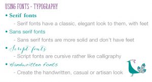
Font families – designer speak
This is the different style of the font that is used and how it best reflects the aim of the project.
These are:
• Serif
• Sans Serif
• Script
• Handwritten.Each font family is suitable for a different type of target or sector, and creates a different feel in a design. Bad design often happens when the wrong type of font family is used.
-
Font
This is the style of the font itself, how it looks. There are thousands available online, which makes choosing the right one rather overwhelming. As with the font family, some fonts are better used, in one target or sector, than another. Getting it wrong, can again create a dissonance, between your design message and how the client perceives it.
-
Font weight

Font weights – designer speak
The weight of a font means whether is is ‘regular’, bold, italic, thin, heavy and so on. Some fonts, often those used for titles, come in just one weight. Others come in bold and italic as well. Some of the larger font families come in the usual weights, and extras such as narrow, condensed, extended and combinations of those such as narrow condensed. The most well known of those is Helvetica Neue and gives you complete flexibility.
-
Point size
This is the size of the type and start small and go as large as you need. The minimum point size for a business should be 7pt. However remember your audience and make it easy for them to read your message. The standard size for a leaflet is usually around 11pt, but the RNIB recommends 12pt when designing leaflet for those with sight problems.
-
Font hierarchy
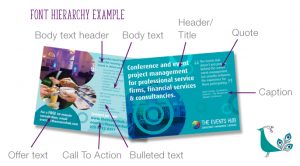
Font hierarchy – designer speak
This is the different levels of importance of text in a design or document, such as:
• Headline
• Subhead
• Body text
• Caption
• Pull quote (Where you highlight a quote separately as a graphic part of the design)Balancing these well means that your document is legible and easy to read, meaning your message is more likely to resonate with your target.
-
Resolution
This refers to the size of the image
• Large resolution – image more detailed and sharper – suitable for print
• Small resolution – image less details and fizzier – suitable for web -
DPI
This also relates to resolution and the sharpness. This is Dots Per Inch.
• 150 dpi – sometimes used for print – depends on the type of job
• 300 dpi – the standard resolution for print
• 72 dpi – the standard size for webImages with 72 dpi load faster on the web, but can’t be used for print, Make sure you supply your designer the right sized file.
-
Jpeg/tiff/eps/psd/bmp/png/gif
These are different image formats, some suitable for print and some only for web:
Print
• Jpeg – large resolution jpegs can be used in print
• Tiff – this is a large file and can be layered – not used so much no that jpegs are better quality
• Eps – this can either be a rasterised file – Photoshop (see below) or a vector file – Illustrator (see below)
• Psd – this is a layered rasterised Photoshop file
• Bmp – can be used for print – good if you can to colour up a black graphicWeb
• Jpeg – small resolution jpegs can be used on the web
• PNG – this is used for figures, diagrams basic images and screen shots
• GIF – these are simple animations -
Rasterised/vector
This is the type of image – how it is made up:
• Rasterised images – pixel based and are usually photos – this is why the resolution is so important. If there aren’t enough pixels in the image, it will be blurred.
• Vector images – made with lines so give sharp edges – good for graphics and illustrations – they are scalable without loss of resolution -
CMYK/RGB
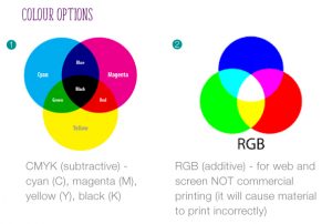
CMYK & RGB colours – designer speak
This refers to the type of colour:
• CMYK – used for print
• RGB – used for web, screen, TV etc -
Pantone/spot/PMS colour
Pantone colour chart – designer speak
These are different terms for the same thing in print – colour. Pantone Matching System is a colour matching system – hence PMS. Like the paint swatches in DIY stores. Each colour has a number and can be matched by any printer across the country and the world.
It is a way of ensuring consistency in your brand and your marketing collateral. Each time your commission a piece of design work, you need to inform the designer what your brand Pantone colours are.
-
Low res pdf
In full this is low resolution pdf. This is the usual way that designers send proofs to their clients in this digital era. These will be small enough to send via email, and may not show sharp imagery. Do not send them on to a printer if you think the design is finished, they’re not suitable for print.
-
Bleed
Iconic Creative leaflet showing crop marks and bleed – designer speak
In a design context, this refers to images, shapes, colour and lines that ‘bleed’ over the edge of the design. When the printer cuts the project on the guillotine, if the paper slips, there won’t be a white line down the edge, so bleed is needed to stop this.
-
Crop/trim marks
These two terms are interchangeable. Crop marks designate the area/size of the project – for instance, an A5 leaflet. The designer will add the crop marks/trim marks when they make the final print ready pdf.
-
Print pdf/print ready pdf/camera ready artwork
These are all terms for the same thing. After Sign Off, the designer will create a final ‘high res’ print ready pdf. This will have crop marks, bleed, be high resolution and suitable for print. Sometimes, particularly if the printer is a news publishing, or signage making company, they may require a final print pdf with a specialist type of high resolution pdf. Check with your printer.
Camera ready artwork is the old fashioned term, used when artwork was physically created. Each piece of artwork had to be put under special camera to make the printing plates.
-
Proof
Once the printer has received the high res pdf, they will create a proof after running the pdf through their print setup software. Nowadays this is a called a ‘soft proof’ – a digital pdf they will send on email or via a link.
Check this thoroughly. Sometimes when a pdf is run through this software (or ‘ripped’), elements can disappear, or stray items can appear.
If your print run is a huge magazine or brochure, probably being produced lithographically, it is highly advisable that your ask for a physical proof of each page. This shows each spread/element in the closest colour that you will get with out actually printing. This lets you can check colour consistency more easily. It also allows you to check the ‘pagination’ (order of pages) is correct.
Hopefully this guide has helped you feel more confident in understanding ‘designer speak’.
Check out the 13 key steps in the design process in this blog
To see more examples of the extensive design work I’ve carried out for my clients visit the Design page of www.iconiccreative.co.uk.
To discuss your design requirements email me at info @ iconiccreative.co.uk or call 0775 341 3005.

13 key steps in the design process
Many businesses, especially start ups or small businesses struggle with the design process and how to work with a designer. Here is an overview of the process to make it easier to understand.

A brochure design showcasing wholesale artisan bakery Debaere
There are 13 main steps – the ‘designline’.
-
Client need
Your business has a design requirement: a logo for a new venture, a leaflet or flyer to promote an event or offer, an exhibition stand or roller banner for an expo. Your design skills are limited, you find it very confusing, you need expertise.

Logo & branding, leaflet and business card design for Vieri hair stylist
-
Approach designer
You research local designers and find one that you feel meets your needs: experience, quality, price and so on. You ask them to quote for a job.
-
Design meeting/conversation with designer
It is difficult to quote for a job when you don’t know exactly what it is the client needs or wants. Sometimes they don’t really know themselves.You have an initial conversation with the designer to tell them what you’re looking for.

Leaflet design for The Events Hub
-
Full creative brief decided – scope of work
Often in the conversation with the designer the scope of what the client wants and needs becomes larger. Be clear on what you want.
A full creative brief for the project (often called the scope of work) should be completed, so the designer knows exactly what is required.
-
Initial concepts to client
Once the contract has been signed the designer will start work, fitting the project into their work load, taking into account your deadline and what else they have on.They will create initial concepts or layouts depending on what the client requirement is.
For logos (depending on what price has been agreed), 3 (or more) concepts are often created. With a leaflet, one initial design is usually created (unless the client has specified more in their initial brief). For a brochure, ideas for spreads are usually the case – for instance, a front cover, a double page spread (dps) showing how the contents and introduction may look and a double page spread of how the main pages could look.
The designer will then send these to the client, as a low resolution pdf, or other sharing platform.

Star wars exhibition design for Hasbro
-
Client reviews designs
The client then reviews the suggested designs. You may want to take a few days (depending on how urgent your deadline is), to ‘sit with’ the designs, so that you know whether they resonate with you and whether they meet your needs. You may want to get peer input from friends, business contacts and so on.
-
Feedback to designer
When the client is ready, give your feedback to the designer, detailing what elements you did like and anything you didn’t, or felt didn’t quite meet what you had in mind.

JLB Support Solutions logo design
-
Designer revises design/s to feedback
The designer will then take on board you comments and revise the work.
-
Designer resubmits designs to client
The designer will supply you with revised low resolution pdfs to review. Most designers include 1 round of revisions in their price. Any other revisions are usually then charged on top pro rata in an hourly rate.
To avoid extra revision charges, make sure:
• Your initial brief is very clear
• Supply final approved copy (text) to your designer when the project first starts
• Images you supply are good enough quality for print
• Don’t keep chopping and changing the scope of the brief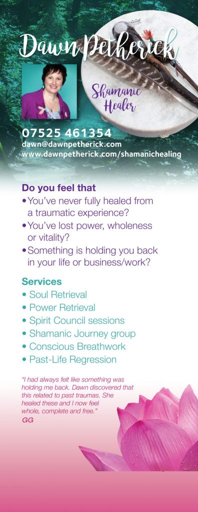
Roller banner design for shamanic healer Dawn Petherick
-
Client approval/sign off
Once you’ve checked the proof and are happy with it, the designer will ask for your approval in writing. Usually by email is good enough, but some may use a more formal sign off sheet.
What you need to check when signing off
• That you have checked all the copy is spelt correctly and reads properly
• That the date, time and venue of an event is correct
• That the copyright for the images you have supplied is either yours, or you have got the correct copyright permission from the image owner.
• That important elements aren’t missing, off the page, or covering something else (they shouldn’t be but sometimes when a pdf is created technical issues can happen)
• The size is correct (it should already be, but still worth checking)NB: Once you have signed the design off, the responsibility for there being anything wrong with the design rests with you. Be very thorough in your checking.
-
Designer provides final files
Once the designer receives final Sign Off, they will create the final files for you. This could be final high resolution print files or files for you to share online or elsewhere.
Bespoke, hand glued invite design for an international property company
-
Printing
If the job requires printing, send your file to whichever printer best serves your needs. Some designers offer a Print Management service, where they source a printer for you and manage the whole process.
-
Design brings results
Once you get the printed job back from the printer, or the web files from the designer, you can start using it. Everyone loves it and it brings you results.
Lego retail ceiling design
To read about ‘designer speak’ – the terms that designers use, read my next blog here
To see more examples of the extensive design work I’ve carried out for my clients visit the Design page of www.iconiccreative.co.uk.
To discuss your design requirements email me at info @ iconiccreative.co.uk or call 0775 341 3005.

Who inspired my Father Christmas character?
Last Christmas I launched 5 new Father Christmas cards to add to my range of photographic greetings cards that I sell in varying outlets. They’re slightly different in that they’re illustrated rather than photographic cards, but personally speaking I think they’re lovely, very cute and lots of fun.
Each illustration is different and each card has a little story about Father Christmas on the back.
But you may be wondering where the inspiration came from for the cards. It was my Dad who was my muse. With his fluffy whiskers, smiley face and cuddly physique, he made the ideal Father Christmas.

Dad and I in an am dram production of Orpheus in the UnderWorld (and yes that is a wig I’m wearing lol)
I was very lucky, I had a great childhood and both my parents were very creative. My mum could paint, cook, sew, and loved to read (she was a professional librarian and later ran children’s playgroups), whilst my dad was a photographer and once worked for Tony Armstrong Jones, aka Lord Snowden, (yep that’s where I get it from), could also paint, tried his hand at DIY (not always very effectively mind), loved to act in amateur dramatic (amdram) productions and also sang, in a jazz band (the Red Hot Polyphonic Troglydites), in the church choir, musicals, you name it, he would act or sing in it.
“I know a shortcut”

Yep, I was into photography even then
He also taught himself to play the guitar and banjo, so there was always music around too, one way or another (did he sing in the shower? I can’t remember lol). They both used to be members of the Ramblers Association and we had many a camping holiday trekking across moorland or visiting country houses. His ‘shortcuts’ (across precarious cliff tops or desolate moorland) were infamous in the family. We enjoying a nice clotted cream tea or a Cornish pasty. Often he would buy a fresh crab and ‘dress’ it, for a tasty supper. He had an allotment and also turned the top part of the garden over to fruit and veg, so there was always lots of home grown produce.
Christmas

Dressed for an Am Dram production, probably a Gilbert and Sullivan one
Because Dad worked for the BBC in film processing, he wasn’t always around on Christmas morning. Sometimes he had to work a shift at TV Centre, so often we would have Christmas Dinner late in the afternoon. We had our small pressie stockings from Father Christmas in the morning. We had little gifts such as magic tricks, or notepads & colouring pencils. Chocolate coins & satsumas were tucked at the bottom. After dinner would be THE time all us kids waited for. But Dad, being Dad would tease us just that little bit more, until we were beside ourselves with excitement. He would proceed to do the washing up, exceedingly slowly. Then he would decide it was time for a cup of tea (with us kids crying out ‘Come….on…Dad…..!”), and then, only then, could we all sit round the tree, with one person handing out the presents. To eek that special moment even further, we each opened one present at a time, so that we could all see who had given what to whom. You can imagine just how excited and on tenterhooks us kids were 🙂
He lived life to the full
Despite suffering from a rare genetic disorder and a serious heart condition most of his life, he loved life and lived it to the full. He love his food and even made his own home brew beer and wine (material for another blog perhaps lol) He carried on as long as he could with the acting, singing and guitar playing. I learned to keep going, whatever life throws at you.
Dad made the musket as a prop for a play. The gold bits were doilies cut & sprayed gold. We had a break in once and the police turned up. They looked very carefully at the musket before realising it was a model lol

Dad with his hand made musket
Happy Christmas Dad, hope you like the cards 🙂
Who inspires you? I’d love to hear from you.
Check out some of my previous work at www.iconiccreative.co.uk
To find out how I can help you create atmospheric portraits, or event coverage, call me on 0775 341 3005 or email info@iconiccreative.co.uk

Crop your photos for more impactful images
Do you crop your photos? Taking or creating, a great photo is more than just clicking the shutter or pressing a button.
Even with phone snaps, selfies and Instagram you now have lots of options to be more creative with how your finished images look. Filters are the most common way of changing an image, but another effective way is cropping your image.
CROPPING YOUR PHOTOS

Polaroid style photo frame
Cropping your photo isn’t just a way of getting rid of unwanted detail, it is a creative tool to help you add emphasis to elements in an image and make it more powerful. Or in other words framing your image.
Every time I do a photoshoot, I download my images into Lightroom, review them and choose the ones I think look best artistically, or that show the best event coverage. I do any necessary colour and sharpening to the images to create the effect/s that I want. I also look carefully at each image to see if I think it needs cropping.
White or negative space
When I do this, I look at the white or negative space around the image, is the subject (a portrait or something at an event) too small in the photo and would they benefit from being bigger in the final photo? Or at an event, is there part of a person on the edge of the photo that makes it look really ugly, or that has no relevance to the topic and would be better gone?
Lightroom
Lightroom allows you to make flexible crops to an image and reset it if it doesn’t work the way you want. You can also create virtual copies so you can try different crops (and effects) on the same image. There are lots of editing that suit any budget, check out what each one can.
Examples
A TIGHT CROP

Image showing how cropping improves a photo
Here’s an example from a recent shoot I did for a play at Questors Theatre in Ealing. The pic shows how the photo looked in Lightroom and the crop tool. As you can see I’ve cropped it quite tightly, for several reasons. Firstly to get rid of the feet on the right hand side of the image. Secondly to get rid of a lot of the empty room. Because the shot is a rehearsal shot of a play, I wanted to focus the attention on the action happening in the main part of the image. The images from the shoot went up on the promotional board outside the theatre, so visitors want to see the play, not the room behind the actors.
Here’s the final cropped image. It’s much more intimate (like in a restaurant) and there are no distractions from unimportant elements.
I also look at things like the horizon (if it’s a landscape shot) and using the crop tool in Lightroom I can line that up with the cropping grid.

The finished crop
A LIGHTER CROP

Crop of a portrait for Dr John Rowe, copywriter and proofreader
Here’s another example, this time from a recent portrait session with Dr John Rowe from Dr John Proofreading & Copywriting.
I wasn’t quite as tight with the crop this time as the image didn’t need that, there was just a bit too much space at the top and the sides of the image.
With this crop, the image looks balanced and the viewer’s eye follows easily around the image.

Final crop of a portrait for Dr John Rowe, copywriter and proofreader
CHANGE THE FORMAT

Changing the format is a good crop technique
You can also change the format of an image. You may have taken the photo as a landscape, but there is too much space around your subject. Cropping it in a vertical format gets rid of the extra space and makes your subject more important.
CHOOSE YOUR OWN FORMAT
You may have an image that you really like, but that doesn’t look right in either landscape or portrait format. Choose the format yourself by rotating the crop tool. This techniques allows you to ‘save’ a photo that you really like and want to use, but that won’t work in any other way.
In the following image I loved how the acrobat was moving and how the cloth and the shadows were positioned. However, I didn’t like the fact that the top of the paper roll was showing at the top. I also didn’t like the shadow at the bottom, so I rotated the crop tool to get the shot I wanted. Going tighter would have cut too much of the shadow of her leg out of the image. I’ve positioned it right on the edge of the picture instead.

Choosing your own crop can add dynamism to your image
To finish…
Check out some of my previous photography at www.iconiccreative.co.uk
To find out how I can help you create atmospheric portrait photos, or event photography, call me on 0775 341 3005 or email info@iconiccreative.co.uk
