
What is photography? – it is not just a picture
What is photography? It has often been described as the pencil of nature and its direct translation means drawing with light. It is a practise that enables us to capture what we see around us in a durable way.
Digital photography records light electronically onto a sensor, whilst older photography methods chemically capture images onto a light sensitive medium.
BUT It is much more than that
It is:
- a way of seeing
- a vehicle for speaking
- a way of making sense of the world
- a way connecting to our past
- a method of documenting the human story
- a window on other cultures
- a way of remembering loved ones
- it has been and still is used as a powerful propaganda tool
- it is a way of documenting time
- a way of illustrating
- a tool for exploration
A way of seeing
Nicola – What is photography
Put two people with cameras in front of a model or a scenic landscape and you will never get the same image. Each person will bring their own ideas, experiences and emphasis into play to create a totally personal comment.
A way of speaking
By using photographic techniques a photographer can highlight or draw attention to something they feel strongly about. They can comment on topics that they feel are wrong or that need to change.
See my series of blog posts called Better Photography 101. The different topics show how you can use camera techniques to direct the viewer of your photo to look at certain things. My blog post on cropping photos shows you how by cropping an image you can change the impact it has.
Social commentary
In the years during and after World War 2 magazines such as Picture Post and Life, published photos which commented on and highlighted marginalised areas of society.
They showed
- the conditions endured by immigrant populations
- inner city deprivation
- living conditions of the working class in the East End of London
- It also high lighted the disparity between the rich and the poor
- publishing contrasting images of areas of life such as education.
It was through the influence of publications such as Picture Post that institutions such as the National Health Service came into being.
A way of making sense of the world
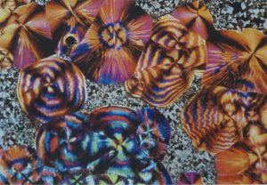
A macro autochrome
Even in the early days of photography, it has been a tool to enable to investigate the world around us.
- Coloured autochrome macro photography(1907) existed and allowed us to explore minute organisms in all their coloured beauty.
- Xrays, CT scans and MRIs allow us to examine areas inside our bodies
- powerful telescopes allow us to explore the farthest reaches of the Universe.
Early days
When photography was first invented, it could only capture images in black and white, allowing us to explore relationships between light and dark, tone and contrast. In 1907 the Lumiere brothers introduce the Autochrome (the first commercially viable colour photographic technique). Photographic representation became more ‘real’. The technique produced beautiful, rich colour images, with red being produced particularly well.
Remembering loved ones and connecting to our past
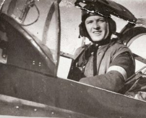
Uncle Jim in his Magister trainer
I’m sure most of us have boxes and albums of family members from the past and favourite photos from our own past. Being a photographer and photographer’s daughter, I have boxes and boxes of them. Small black and white shots, tiny ones from the war, slightly out of focus ones as the person. Images where someone’s head has been cut off slightly, you know the ones.
Do we edit them? Throw them out? Delete them because they’re not photographically and artistically perfect? No, we keep them because they are us, all that we as a species and a person are.
They are our history, our story
Photos help ground us in time. They give our lives value and meaning. A way of connecting us to our past. An archive of all that has been before.
Why did the Victorians photograph their dead children?
Many Victorians would photograph their dead children. This may seem rather macabre to us today. Exposure times were very long and children weren’t always able to stand still for that long. Youth and child mortality was very high. Commissioning a photograph of their dead child, was therefore a way for the parents to capture that all elusive portrait.
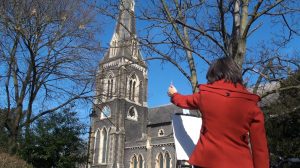
A window on other cultures
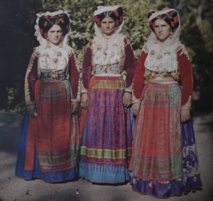
Balkan ladies in their national dress, showcasing how the Autochrome process enhanced the reds of their outfits – What is photography?
Albert Khan was a wealthy philanthropist who lived in France at the time of the emergence of the Autochrome. He believed he could help create world peace and understanding through photography. He bankrolled and undertook a world photographic expedition he called the Archive of the Planet (The Life of Albert Kahn The Wonderful World of Albert Khan).
Kahn and his chauffeur travelled the world, photographing countries as diverse as China, Ireland, Japan, the Western Front in WW1, Africa, Middle East, Asia and Scandinavia. They also photographed notables such as George Bernard Shaw.
The collection of images he produced cover events of historic proportions including
- the death and funeral of the Japanese Emperor at the time
- conditions, troops and weapons in the trenches of WW1
- rural villages in Ireland
- other historic happenings.
Looking through the images, it is hard to believe that they are over 100 years old. They bring the past to life and connect us more deeply with our past and the past of other cultures.
A powerful propaganda tool
A picture is worth a thousand words
During WW2 images were used by both sides to promote their ideals. Picture Post magazine often carried pictures and articles that promoted members of the services. Picture Post photographed women who worked in the munitions factories, helping to improve morale.
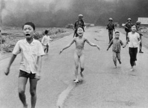
FILE – In this June 8, 1972, file photo, 9-year-old Kim Phuc, center, runs with her brothers and cousins, followed by South Vietnamese forces, down Route 1 near Trang Bang after a South Vietnamese plane accidentally dropped its flaming napalm on its own troops and civilians. The terrified girl had ripped off her burning clothes while fleeing. In late September 2015, Phuc, 52, began a series of laser treatments at the Miami Dermatology and Laser Institute to smooth and soften the pale, thick scar tissue that she has endured for more than 40 years. (AP Photo/Nick Ut, File)
During the Vietnam War, photographers showed the ravages of war, helping to give voice to the Peace movement.
A way of perpetuating hoaxes – The camera never lies….. or does it?
The Cottingley Fairies
The most famous photographic hoax is that of the Cottingley Fairies. Two cousins Elsie Wright and Frances Griffiths who lived in Cottingley near Bradford, produced a series of five photographs which claimed to show fairies dancing in a glen. Many people at the time, including Arthur Conan Doyle, believed the photos to be genuine. For most of their lives the girls continued to claim that the images were real. In the early 1980s the girls came clean, saying that they had created the fairies with cardboard cut outs from a children’s book of the time. Frances however continued to claim that the fifth image was genuine. What do you think?
The Moon landings
Another images that have caused great interest and controversy are those of the moon landings. Most people believe that we did put men on the moon and take photos. Others point out possible evidence that claims to show these images may have been created in a studio. What do you think?
Nude versus naked
Photography has been used in artistic ways to explore the nude and create beautiful erotic images, but with lots of new techniques it is also used by the p o rn industry. When does nude, artistic and tasteful, become naked, p o rnographic and obscene? I’ll leave you to decide that one 🙂
The Selfie
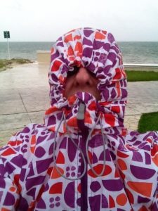
Selfie in Mexico
The latest photographic fad is The Selfie. From the highest to the lowest in the world, we are all self promoting through the wonders of the Smart Phone.
This is a selfie I took in Mexico during one of their tropical storms.
So – What is photography?
I’ve only skimmed the surface of what photography is, in this article. Hopefully I’ve encouraged you to think more about this very powerful tool.
For more information and ideas on ways of seeing read John Berger’s book Ways of Seeing
Other photographic essays about What is photography? you might find interesting are Susan Sontag’s On Photography.
To discuss your portrait or event photography project, call me on 0775 341 3005 or email info @ iconiccreative.co.uk

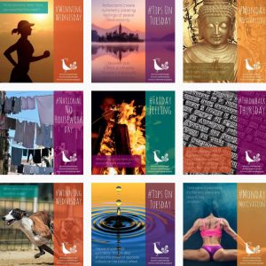
Best of Iconic Creative blog 1
The Best of Iconic Creative blog – Week 1 roundup
Well, the first week of the 30 Day Blogging Challenge is done. Last time I tried it I managed to get to day 8. I’m almost there this time and hoping to go past that marker, this time.
Hopefully you’ve found the posts interesting and useful. I’ve done a short roundup so the posts are in one curated post for you.

Exhibition panel of The Great War for Islington Heritage Centre
Case Study – Exhibition panels for Islington Heritage Centre
A case study showcasing how a passion for heritage helped my client commemorate the sacrifice of local people in Islington during World War 1 here.

Freedom Hotspot exhibition panel design
Tips to improve your exhibition panel design
Are you planning to have a stand at an expo or exhibition? Check out my tips to improving the quality and effectiveness of your exhibition materials design here.
The little guide to mobile phone filming
Thinking of doing Facebook Lives or vlogging but don’t know where to start and what equipment to buy? Check out my little guide to mobile phone filming here for what to buy.

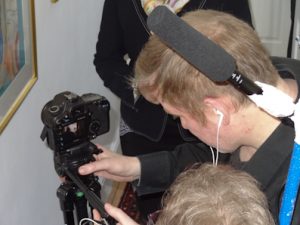
Mobile phone filming kit
The Story behind What did you do in the war Grandad?
There is always a story behind any film: big or small, the story of how it came to be, what the writer or or director had in mind. Read the story of how I paid tribute to my uncle who had been killed in World War 2 aged 20 here.
What did you do in the war Grandad?
Shooting the flashback scenes at The Golden Pot in Lasham
China’s First Emperor and the Terracotta Warriors

The 7 real terracotta warriors
Reviews, on the internet or in person, are usually the way we decide whether we go to see a movie, go to a holiday location, buy a product. Read my review of the China’s First Emperor and the Terracotta Warriors exhibition in Liverpool here.
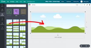
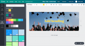
The Tao of Canva – using Canva for your small business
Are you struggling to create graphics for your small business? Don’t have the budget for hire a designer? Learn about the basic Canva tools and capabilities here.
Canva memes
Video promo for Jessica Rose – Painter and Printmaker
A second case study this week, telling you the story of how I created the video promo for Jessica Rose, painter and printmaker here.
Jessica Rose painter and printmaker
What is photography? it’s not just a picture
A more philosophical and esoteric post, this post talks about what photography actually is, rather than just being a picture. Click here to read more.
Hope you enjoyed this Best of Iconic Creative blog roundup this week. Let me know in the comments any other creative blogs that you love to read.
Do you design your own collateral? See 6 mistakes that many people make and how to avoid them, on the Birds on the Blog site.
If you need any help with your design, photography or video projects, call 0775 341 3005 or email info @ iconiccreative.co.uk

Video promo for Jessica Rose, Painter and Printmaker
Case study – video promo for Jessica Rose, Painter and Printmaker
Jessica Rose is a painter and printmaker in Ealing, west London. She also runs watercolour classes, helping her students gain skills and confidence in the art of watercolour painting. She creates beautiful lino cuts and other types of prints.
Jessica’s USP
Jessica’s USP is that she uses her bike as a mobile painting studio, even in the snow. This last winter she was interviewed by the BBC about her work, whilst she was painting in that heavy snow we had.
Before the BBC filmed her, Jessica wanted a video promo that would showcase, not only her painting classes, but her work and her USP.
Writing the script
Being an ex journalist, Jessica was able to write the script herself, which was helpful. We then discussed what sort of scenes might support her story the best. We filmed over several days, to ensure I got the shots I needed.
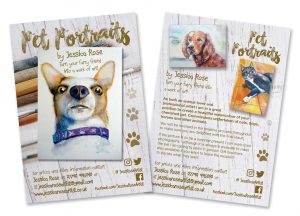
Jessica Rose pet painting leaflet
Filming the bike scene
The main scene we filmed was of Jessica arriving in the ‘Bunny Park’ otherwise known as Brent Lodge Park. I filmed a variety of angles to cover the same scene – a front version, a rear version and a cutaway of the wheels going past the camera. I then filmed Jessica putting up her easel and various scenes of her drawing and painting the church.
Whilst we had written a script to give us the main scenes we needed, I hadn’t written a detailed shot list, so shot more freely to ensure I had what I needed.
Watercolour classes
The next scene that we filmed was one of Jessica’s classes. She got permission from her students to film them. Again I didn’t have a detailed shot list. Because it was quite difficult to shoot around a whole class, I shot a range of wide, medium and close up shots to give me a choice in the edit.
Remainder of the filming
One another day I went to Jessica’s studio again, this time to film establishing shots, her pieces to camera and shots of her products. I also filmed cutaways than I could use, such as brushes being washed, but these didn’t make the edit.
Testimonial
I also filmed a testimonial from one of Jessica’s watercolour class students, which I included in the final edit.
The closing shot
In my head I had a fab idea for a closing shot, of Jessica painting her initials on glass over the camera lens and the camera pulling away so that you could read them. We tried and tried to get this to work right, but couldn’t and ended up going with a static shot of her studio.
Instead I filmed Jessica adding her signature to the finished watercolour of the church, which she had started in the first lot of filming. We filmed the wide shots first, then set up for the close of of the signature. We practised the shot several times and when we were happy, we did the actual take.
The edit
They say that you make a film 3 times, once when you write it, once when you film it and once when you edit it. This was also true in this case. I created 1 draft, which we then edited down until it just under 2 and a half minutes.
I sourced suitable music and created titles to introduce each section of the promo, reflect the quirky nature of Jessica’s USP and the products she produces. Jessica really loved the video.
To see more of Jessica’s work, visit her website here.
Have you been thinking of filming your own video promo or Facebook Lives, but not sure what equipment to use? Check out my blog post The little guide to mobile phone filming here.
To discuss your video promo project needs call me on 0775 341 3005 or email info @ iconiccreative.co.uk

The Tao of Canva – using Canva for your small business
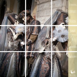
Canva multipic of Venice
The Tao of Canva – using Canva for your small business
Many small business owners struggle with design for their promotional needs, through budget issues and fear of design, colour fonts and so on.
Not all professional designers like Canva for a variety of reasons, including it could be viewed as taking away work from us. Also the fact that people have little understanding of design principles such as using the right font. There is a solution to the small business owner’s problem. The Tao of Canva.
Options
Canva is a basic online design software which allows you to create all types of marketing materials, from social media memes and headers to posters and leaflets. There is a free option which is suitable for most needs and a paid option for bigger organisations and teams, or if you want more flexibility.
Canva grid
Grids
Canva has lots of different grids that you can use to make your design look interesting and keep it consistent too. Some are really basic, such as one square, or 2 squares. Others are quite ornate, with diagonals, slices and other options.
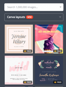
Canva preexisting layouts
Layouts
To get you started Canva has provided extensive predesigned layouts. All you do is replace the image if you don’t like it. Same with the fonts and/or colours and hey presto you have your design.
Canva brand colours & palettes
Brand colours
With the free option you’re able to use 3 brand colours (as well as Canva’s default palettes). To add your brand colours to the palettes, you need to know the hex number (#xxxxxx) for each colour. Your designer should be able to help you with that. There are also free RGB to hex converters available on line.
If you opt for the paid version, you’re able to add more colours, so you’re able to include your secondary palette colours.

Canva fonts
Fonts
Canva has a range of fonts preinstalled, giving you a good range of typographic options. Some of the fonts are similar to standard fonts used in design and Word. One such font is Helvetische, the equivalent font being Helvetica. Aileron is another font which is available in Canva and in design or Word.
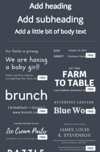
Canva font combos
If you opt for the paid version, you have the option to add your own brand fonts. This helps you keep all your material ‘on brand’.
Font combos
As with the predesigned layouts, Canva provides font combinations for you so that you can get started with typography, even if you’re a novice.

Canva picture tools
Images
There are lots of image options available with Canva. It has a basic range of free images preinstalled. It also has the option to buy some for very low prices ie $1. You can upload your own images that you’ve taken yourself, or got from a stock library. It also has the cool option of letting you add photos from your Facebook camera roll, so you can make posts with your own pics on the spur of the moment if you’ve just taken a photo.
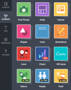
Canva elements
Shapes, lines, icons and charts

Canva backgrounds
Canva has lots of different shapes that can be used in designs: squares, circles, triangles and stars etc. It also provides a vast array of lines, icons and charts that you can use as the start for your design. In the paid option there are also elements such as nature, people, food, business and so on. If you can’t find something there to suit your needs I would be very surprised.
Backgrounds
As well as layouts, Canva also provides patterned backgrounds for your designs. You can change the ‘colourway’ (ie the colour) of these designs easily, again providing you with a way of keeping your material consistent and ‘on brand’.
Examples of what you can make in Canva
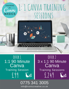
The Tao of Canva training
To help you get to grips with Canva, I have 2 offers available.
1) Offer 1
1:1 90 Minute training session for £99.
During the session I guide you through all the tools, how to use them effectively and adding advice on design principles and techniques to add that extra zing to your designs.
2) Offer 2
3 x1:1 90 Minute training session for £249.
In the sessions I take you further into creating your own designs, taking you through the tools, talking about design principles. I help you create a leaflet or poster for print, explaining things like bleed, crop marks and creating a print ready pdf.
To learn more about the design process check out my blog post 13 key steps in the design process here.
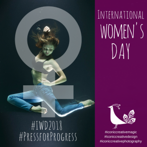
International Women’s Day canva meme
Using the Tao of Canva is a great way to celebrate calendar holidays such as #InternationalWomensDay. Check out my Instagram feed here for more samples.
To book your Canva training sessions, or to discuss your design projects, call me on 0775 341 3005 or email info @ iconiccreative.co.uk

China’s First Emperor and the Terracotta Warriors exhibition
China’s First Emperor and the Terracotta Warriors exhibition, in Liverpool – a review
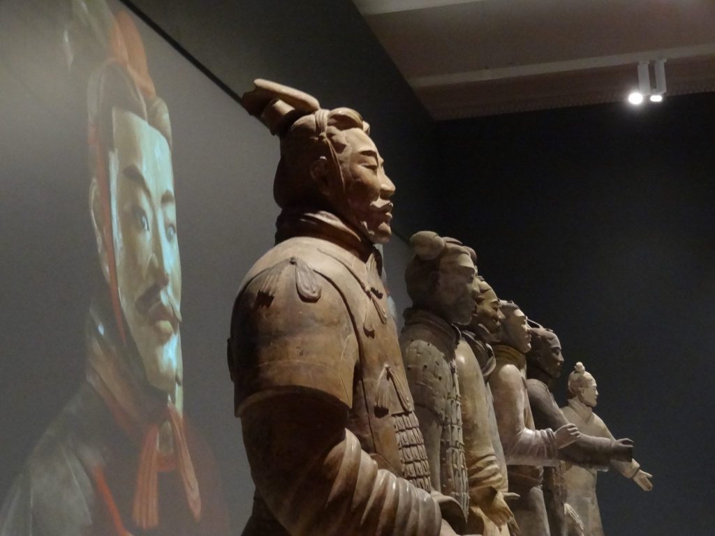
The 7 real terracotta warriors
I’ve wanted to see the Terracotta Warriors for years. Given my mobility issues, the dream of this was becoming more difficult.
Then I saw that it was coming to Liverpool and I knew I had to work out how see it, what ever happened. I did a bit of research of travel, walking distances, hotels, other things to see in the city and booked my ticket.
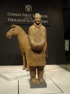
Terracotta Warrior and horse
The exhibition organiser
In May I attended the Museums and Heritage show. Guess who happened to be speaking. Fiona Philpot from the National Museum Liverpool, the lady who had actually organised the exhibition.
According to Fiona, Liverpool was chosen to host the exhibition due to it’s large Chinese population. She and her lead designer visited China to research the culture, design, history and other aspects, that would provide inspiration for the exhibition.
The design
At the entrance to the exhibition, on the ground floor of the Museum, stand 2 colourful replica warriors. Red chinese lanterns line your way to the main doors.

One of the exhibition panel designs at the terracotta warriors exhibition
The introductory video isn’t shown on a plain video wall, but a multi faceted, projection. Different clips of film are projected on each projection, creating a kaleidoscope effect.
The first exhibit is a fabulous warrior and his horse. It is free standing so you’re able to see all the way round and is a great introduction.
The exhibition walls slope upwards to reflect the walls of the tomb that the warriors. The top of the display cases have ornate wood fret work and are backed by red. The inspiration for this apparently came from a restaurant that Fiona and her designer visited in China. To reflect China’s importance in introducing silk, huge silk banners drop from the ceiling. Each tells a different aspect the story of the Emperor, how he unified China and the warriors.
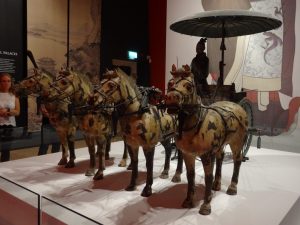
A half size replica charioteer and horses at the terracotta warriors exhibition
China only allowed 7 of the actual warriors to leave the country. Each warrior represents a different type of warrior. An infantry man, a General, a charioteer and so on. A video is projected behind them. This gives the idea that there were more warriors with them in a tomb,
There is a half size replica of a chariot and 4 horses. These are also free standing, which allows viewers to see them from all angles.
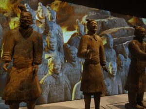
Some of the real terracotta warriors
Around the sides of the exhibition are other panels and artefacts telling the story of Qin Shi Huang who died in 210 B.C. He conquered 6 neighbouring states to become the First Emperor. His tomb is still unopened, even though his warriors are still being excavated and the last display in the exhibition creates an animated idea of what the inside of his tomb might look like.
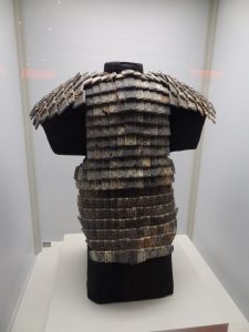
A stone suit of armour at the terracotta warriors exhibition
Conclusion
Luckily I knew beforehand that there would only be 7 real warriors in the exhibition. I heard other people saying how they had expected more and were disappointed. May be a notice outside would manage visitor expectations more effectively. If I had travelled all the way to Liverpool from London, not knowing there were only 7 warriors, I would have been extremely disappointed.

A giant bowl at the terracotta warriors exhibition
Another negative, for me. There was very little about how the warriors themselves were made. Or how they were painted. The only time your see a painted warrior, is at the main entrance to the exhibition. Or briefly in the video behind the warriors.

Three of the terracotta warriors
There are several programmes about the warriors and how they are made. Each warrior is different. Artisan craftsmen made them. There is a possibility the craftsmen may have been influenced by European craftsmen. There was nothing about this. I love crafts and seeing how things are made, especially historical artefacts. This was disappointing. To me that seems as though it should be an key part of the exhibition.
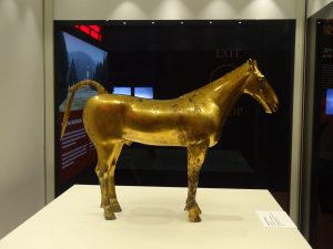
A gold horse at the terracotta warriors exhibition
On a positive note, the flow of the exhibition seemed good, except of course, in front of the real warriors. You can move round freely and see most of the exhibits easily. Accessibility is good and the staff are very helpful. To be able to see all those wonderful artefacts, close to is great. To be almost eye to eye with a warrior was an amazing feeling.
Read about my exhibition panel design for Islington Heritage Centre here.
Other samples of my exhibition design can be seen here.
To discuss your exhibition design project, call 0775 341 3005 or email info @ iconiccreative.co.uk

The Story behind What did you do in the war Grandad?
The Story behind how I made What did you do in the war Grandad?
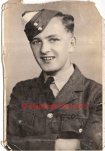
F/S James E Linehan
I’ve been researching what happened to my uncle and his crew during WW2 for over seven years. They were shot down on 8 April 1942 and have no known grave. Chatting with my neighbour who works in the film industry as an SFX artist, the idea began to develop that wanted to make a short film about what happened to them. I began to get involved on small independent film shoots, helping out as a production assistant, runner or stills photographer, to gain some experience of how things worked during a shoot.
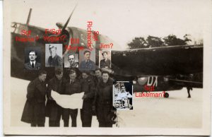
The crew of Wellington x3757
But what about the script?
Alfred Hitchcock said “To make a great film you need three things – the script, the script and the script.” It is THE most important aspect of a film. If it’s not right, the film won’t be right. I spoke to several script writers about my ideas, but realised that by the time I’d told them everything I wanted to use in the script, I might as well have done it myself.
So I did. Despite never haven written a script before.
My initial plan
My initial plan was to write a 15 minute short, but I found as the story wrote itself, the run time expanded to 45 minutes. Not having done any creative writing since my school days, I was extremely nervous about the results.
My first review
I emailed it to a friend of mine who is an author and sat nervously waiting at my computer for her response. Half an hour later she messaged me back saying she was sitting reading it with tears streaming down her face and that it was beautiful. I was stunned with such a reaction and it gave me the confidence to think that perhaps that I’d produced something worthwhile.

Kevin & Sarah Arrow – What did you do in the war Grandad?
Professional reviews
I then sent the script to a script consultant for their input. They had offered several options for me to explore and suggestions to help improve the drama and tension. I gradually implemented their ideas. They suggested that I make the story into a feature film, rather than a short. A daunting suggestion to say the least.
Expanding my story
I spent hours on the tube, at lunchtimes and whilst watching TV tapping away on Final Draft for ipad, moving scenes around, adding in more characters, expanding scenes and putting new words in the mouths of my characters. Gradually the story began to take form.
What did you do in the war Grandad?
Shooting the flashback scenes at The Golden Pot in Lasham
What could I do about the ending?
But I was still stuck for an ending. The crew died and never came back home. I haven’t yet found the plane yet. How was I going to end something we already knew the ending to?
I received my uncle’s Bomber Command Clasp and an idea began to form for the ending. As I wrote, I got a pain in my heart and a lump in my throat. The tears began to fall. I realised that I was on to something. Finally I had found a viable ending to the largest piece of creative writing I’ve done to date. I had written a screenplay! What an accomplishment.
The second professional review
I sent the second draft to the script review company and they came back with more suggestions to improve the script. It’s pretty daunting as the script is now over 120 pages. I invested in Final Draft full version to help me manage the scene order, the characters and so on.
What did I do next?
What did you do in the war Grandad?
Shooting the flashback scenes at The Golden Pot in Lasham
I saw an advert for a competition for 3 minute short films and thought maybe my neighbour and I could enter it. I sent him the details and he loved the idea, so I began to think about what I could write this time. Using what I already know about the WW2 RAF, I based the idea around a WW2 RAF veteran who is visited by his grandaughter. She finds his medals and he tells her about what he did in the war.
Building a team
Time was paramount as the deadline for the competition was coming up, so I had to source cast members, medals and period photos as props, and locations fast. Actor friends recommended someone for my ‘Grandad’ and he very kindly agreed to help me. Sarah Arrow of SarkeMedia suggested her daughter Jasmine for the role of Lucy, the grandaughter.

Mum and Lucy arriving – What did you do in the war Grandad?
The first audition
Jasmine created a video audition of my script and it was great seeing my words come to life as Lucy. And lastly for Lucy’s mother I asked another actor friend if she was interested and she was, so I had my cast. I bought the medals on ebay and my Bomber Command friends sent copies of their relatives photos and letters for me to use as props.
Disaster strikes
Then the dreaded lurgy struck. I was laid up for over a week and had to cancel my first ever film shoot. I was devastated as we missed the competition deadline. Trying to look at things on a positive note, I then realised that we were no longer restricted by the 3 minute run time and could now make the short a little longer.
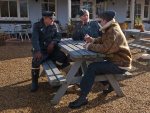
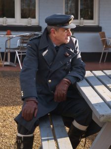
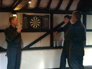
The RAF Re-enactors
What did you do in the war Grandad?
Shooting the flashback scenes at The Golden Pot in Lasham
Part of the film (called What did you do in the war Granddad?) is a flashback scene of the veteran during his war days. We used WW2 RAF re-enactors so they had all the necessary kit. We filmed in a pub near Lasham called The Golden Pot. The owners were lovely and let us film in the gardens, the skittle alley and inside. The re-enactors are from Ops 39-45 and regularly re-enact RAF and WW2 characters. They were wonderful, so patient and offered knowledge and suggestions. We had a great day, despite the cold.
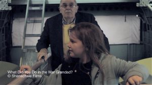
Filming
Our next scene was Grandad looking through his photos and medals. We filmed it in a friend’s house. Trying to film in the hallway as Grandad opened the front door proved the most challenging scene, and I had to stand on the stairs behind the director, holding the boom mic over his head, so that we could actually get the shot and decent sound.
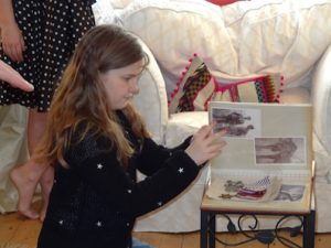
Lucy looking at Grandad’s photos – What did you do in the war Grandad?
RAF Hendon
Having gained permission, we then shot at RAF Hendon, in north London. We spent a great day shooting around the Lancaster, the Lysander and the Sunderland WW2 planes. The most challenging section of filming was inside the Sunderland for several reasons. It’s not the easiest of planes to get into, you have to bend to get through the door, which proved a little difficult for ‘Grandad’. Then the gangway was so narrow that the actors could barely get past the director with the camera, whilst also looking natural.
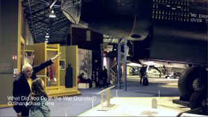
Meeting the Lancaster – What did you do in the war Grandad?
The Bomber Command Memorial
Our final scene was to be at the Bomber Command Memorial in Green Park. This proved exceedingly difficult to organise, with the date being pushed back due to various reasons, particularly the cold and wet weather. As the producer I am responsible for peoples’ safety whilst filming. The Memorial is an open structure with no cover, no facilities and no easy access to warmth. I couldn’t have the cast, particularly ‘Grandad’ standing around in that space for hours in the cold.
The Final Scene
Visiting the Sunderland – What did you do in the war Grandad?
Eventually the weather finally played nice, and we booked 8 April as our final day of shooting. Suddenly it occurred to me. It was the 74th anniversary of the day that my uncle and his crew had been killed. How poignant!
We shot lots of scenes around the Memorial, making sure we didn’t interfere with visitors. As part of the story we laid flowers at the feet of the statue. We left them there after filming, as a fitting tribute.
Editing
Working with the director I put together a draft cut and then edited until it worked well. Unfortunately, the sound from RAF Hendon wouldn’t sync properly, whatever I tried. I was stuck. I didn’t know what to do. The director suggested just using music. It turned out to be a good choice, the emotion of the edit went up several notches, through that simple change.
Checking a take – What did you do in the war Grandad?
Rotoscoping
Rotoscoping is a way of masking/cutting out objects in a film clip and is used to hide/replace unwanted elements in an image. I spent ages rotoscoping out modern posters and paintings in the film, replacing them with war time propaganda posts and notices to make the film more authentic.
The Premiere
Premiere of What did you do in the war Grandad?
We held the premiere of What did you do in the war Grandad? at Thames Valley University and it was attended by a local journalist, who very kindly wrote a piece in the local newspaper for us.
Competitions
Independent film makers often enter their films on competitions, to help raise their profiles. I entered our film in lots of competitions. Very excitingly we were long listed for the Winchester Short Film Festival, but unfortunately didn’t get through to the short list. Even more excitingly, we were accepted into a film festival in Santa Monica in 2016.
For some one who knew very little about filmmaking eight years, had no experience of script writing, but just a dream and an idea, I’m very proud of what I was able to achieve, with the help of friends and colleagues.
If you’re thinking of making your first short film, check out my blog post Making short films on a budget for tips.
For help with scriptwriting, promos and filmmaking call me on 0775 341 3005 or email info @ icnoiccreative.co.uk.

The little guide to mobile phone filming
The little guide to mobile phone filming
Mobile phone video is becoming more and more important in helping us reach a wider audience. You may be wondering exactly what equipment you need to invest in to take advantage of this trend.
I’ve put together a list of the basic things you might want to consider for your video kit.
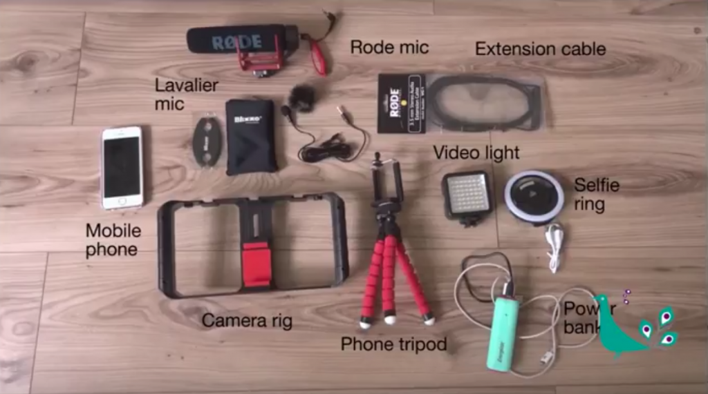
Mobile phone filming kit
Smart phone
As smart phone cameras become better and better, they are great for on the fly interviews, vlogging and Facebook Lives. You can of course use more sophisticated cameras, depending on your budget.
Sound
Whether you’re a small business creating vlogs or Facebook Lives, or a large film production company, ensuring your film or video has great sound is critical to the success of your output. People will put up with badly filmed video, but will switch off if they can’t hear the sound properly.
Microphones
To ensure you get decent sound in your videos, you will need a microphone. There are different types of microphones available. They all do different things and have different directional capabilities: omnidirectional, bidirectional and unidirectional. If you visit any trade show (such as BVE) there are loads of companies selling suitable microphones and of course you can also get them online as well.

Rode directional mic for mobile phone filming kit
Rode mic
One well known brand of microphones is Rode. The Rode mic I have here is their VideoMic Go, Lightweight On-Camera Microphone. It cost me around £50 on Amazon.
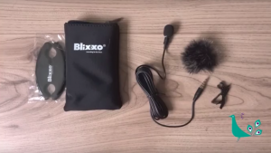
Lavalier mic for mobile phone filming kit
Lavalier mic
The lavalier mic I have here is a Blixxo Lavalier mic BLM-10 and it cost me about £30 on Amazon. It is an omnidirectional microphone and clips on the lapel or other clothing of the person being interviewed, or your clothing, if you’re are the one that is talking. The fluffy thing, is a sock to put over the microphone when you’re filming outside. It stops wind noise on the mic.
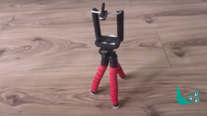
Tripod for mobile phone filming kit
Tripod
To help keep your phone or camera steady, especially if you’re a bit nervous, use a tripod. There are lots of ones available that are suitable for smart phones, like the one I have here.
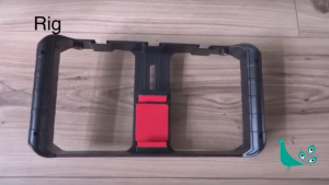
Flat view of camera rig for mobile phone filming kit
Camera rig
You can also use what is called a camera rig. This allows you hold the camera steady and add lighting and a microphone to is as well, making it easier to film.
Tripod, rig & mic setup
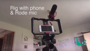
Camera rig and mobile phone, on tripod, with Rode mic, for mobile phone filming
In this pic I’ve set the camera rig on top of my photography/film tripod, added a light and the Rode mic. This means my footage is stable and I am hands free to talk directly to my viewers, without having to worry about keeping the camera pointing in my direction.
Lighting
How you light your video is also important. This doesn’t have to be expensive. Natural light is often the best way to light anything, be it a photo or a video. Think about the direction of the light. Light coming through a window is directional, so if it is very strong, will give strong shadows on the other side of a person’s face. If you’re filming on a really bright, sunny day, the sun can make people quint, which doesn’t look good on camera.
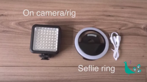
On camera light & selfie ring light for mobile phone filming kit
Diffusing light/reflectors
To help balance the light more easily, use reflectors. Again, these don’t have to be expensive. A sheet, or piece of white paper is a good start to fill in the shadows. Use a light coloured curtain, or even a net curtain to diffuse light coming through a window. I have even used a cheap white shower curtain from Wilkos, which cost me about £1.
On rig lighting
If you use a camera rig, there are spaces to add a light, or even multiple lights. Just be careful if your subject is wearing glasses. It can cause strong light reflections on the glasses. May be use some of the diffusers you have such as the Wilko shower curtain, to cut down on the glare.
Selfie ring
For those all important selfie videos, a selfie ring can add light to your video. This just clips over your phone and is super easy to use.
Power bank for mobile phone filming kit
Power bank
The final bit of the kit is a power bank. There is nothing more annoying than running out of power half why through your interview, or piece that you’re filming. Have at least one charged power bank. More is better.
Check out my video version of this guide on YouTube here.
Making a short film on a budget with your smart phone? Check out my blog post of tips here.
To discuss how I can help you with your video projects call 0775 341 3005 or email info @ iconiccreative.co.uk.

Tips to improve your exhibition panel design
Exhibition panel design
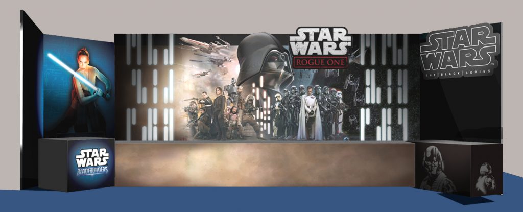
Star wars exhibition panel design
-
Are you a small business thinking about taking part in a trade show or an expo?
-
Are you a larger company looking to upgrade your stand design for more impact?
-
You’ve already spent a fortune on display materials, but they haven’t had the desired effect?
Over the years I’ve worked on several exhibition design projects, from single panels and roller banners, to 15 panel pieces that cover a whole room. I’ve picked up lots of tips and thought I’d put these into a blog to help you.

Dawn Petherick Roller banner
1)Intent
As with any design project understanding exactly what you are creating the exhibition panel or other material for, and what you want it to do.
As the name suggests the design is for an exhibition, not a brochure, and so needs to be short, clear and succinct. It needs to stand out in a large crowd of people, be visible across a crowded room, catch some one’s attention and project a clear brand message. Don’t do what one person I met did, and try and put every single service that his company did on his roller banner. It is a waste of your money as no one will be able to read it until they are 2 foot away.
2) Purpose & positioning
You might be wondering what the difference between intent and purpose is. What I mean by purpose is, how you actually want the exhibition panel or roller banner to be used.
Is it/will it
- Stand either inside or outside a door to a conference or talk
- Stand beside or behind your table or stand at an exhibition
- Is it advertising a new product or service and so on.

Mobile Movie Magic roller banner
Banners for small businesses
Depending on what its purpose is, will (or should anyway) dictate where you put all the elements on the banner. For instance, if you’re a small business taking part in an expo for the first time, you will most likely be putting your banner behind your table. If you then put all your contact details at the bottom of your panel or banner, they will be hidden behind your table and no one can see them. Consider moving them higher up the panel/banner.
Exhibition panel design for larger businesses
If you’re designing material for a larger exhibition or trade show, consider peoples’ eyeline, where your stand is positioned on the ground plan and where people are likely to approach your stand from.
- A corner/junction stand where people approach from multiple directions
- An aisle such as the ‘street’ at The Business Show
How people will view your banner
In the later option people are likely going to be crammed in a queue of people trying to get down the ‘street’ so may not be able to stop for long, so your message needs to be very clear, so that people can see it in one glance. The multi approach is easier in some ways as people can stand back to view your message. In small local expos, using a banner helps attract attention across a room full of low level tables and makes you stand out from the other small businesses.


Circle Band pop up banner
3) Design and images
Brand and brand colours
As with any piece of material for your business your panel/banner needs to have your brand on it, to make it instantly recognisable as representing your business. Speak to your designer to make sure they know your brand colours. Because a panel/banner will be printed, any colours used need to be CMYK or Pantones (PMS or spot colours), not RGB.
Brand font/s
Again, to keep your design ‘on brand’, make sure you use your brand font/s. If you only have one brand font, research appropriate supporting fonts to showcase your message. Don’t use an ornate script font if your company provides a service such as IT support, as I saw one company do. It is not the right font or font family for that type of business. See my links below that give details about the main uses for font families.

Beauty & the Beast 1.5 panel exhibition panel design
Images
One of the most common mistakes I see when small businesses design exhibition panels and roller banners, is the images they try and use. Banners are very large, taller than most people. Images from your smart phone just won’t be big enough to print.
Hire a photographer
Hire a photographer (such as me) to take bespoke images targeted towards your brand and message. Professional photographers shoot in a RAW format. This is like a digital negative and retains all the information in the image and means the image is huge. From that RAW file the photographer will export TIFFS and jpegs. If they use software such as Lightroom (like I do), they have the option to export TIFFS and jpegs at larger resolutions, so can supply you with large enough images for banners.
Stock libraries
If you don’t want to hire a professional photographer, use a decent stock photo library. There are loads around, with a vast array of free and paid images. When downloading/purchasing images for print, and particularly when designing a panel or banner, select the largest possible image size for your download.
4) Shell unit design
Whilst there are now lots of free standing, pop up exhibition panel design options available, you may decide that you want to use the ‘shell unit’ provided by the exhibition organisers. The main points above are still relevant, but there is another thing to consider when designing these.
Technical specs
The organisers will supply your with technical specs for the shell unit. Your exhibition panels will need to be custom designed to fit. If you create a design with an image or graphic that covers the whole side of a stand, you need to take into account the panel dividers when creating the image.

Freedom Hotspot exhibition panel design
This exhibition panel design above, I created for wifi hotspot company Freedom Hotspot when they exhibited at the Hospitality Show. I designed their graphic to cover all exhibition panels, but I had to allow space for the panel spacers. This is the critical point to remember: to make the image view correctly, I didn’t just space the image apart, I had to ‘subtract’ the width of the spacers from the image. Any easy mistake to make if you’re not experienced.
Eyelines
We talked about eye lines earlier. I’ve been asked why I didn’t put the images at the top, or higher up the design. This was to ensure that my client’s key messages were are peoples’ eyeline as they approached the stand. I used the flowing wave graphic at the top of the graphic to add cohesion across all the pieces and add visual interest as the images were at the bottom.
Allowing space for facilities
With this example the client also wanted a TV installed. To ensure that it was installed at the correct height for people to view it, I checked the height of the counter cupboard in front and then made sure the TV AND the contact details were visible above the cupboard. All easy things to do, but easy to miss if you’re creating a shell stand exhibition panel design for the first time.
Top tip: facilities
Remember that there will be items such as lighting, power units, cables and so on, sited in various places on or around your stand. Make allowances for these too when creating your design. Check the technical specs or talk to the organisers to ask what might affect your design.
Top Tip: consider designing a custom facia header board
Each shell stand normally comes with a pre designed and numbered facia at the top, so that people can find your stand. I designed a custom facia, which proved a great idea as loads of people kept looking up at the stand.
For more tips on design check out my blog post What your designer needs from you here and my blog post Understanding ‘Designer Speak’ here.
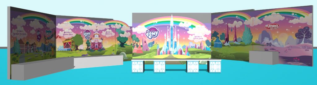
My Little Pony 15 panel exhibition panel design for a whole room
To discuss your exhibition panel design or roller banner design, please call me on 0775 341 3005, or email info @ iconiccreative.co.uk

Case study – Exhibition panels for Islington Heritage Centre
Case Study – Exhibition panels for Islington Heritage Centre
Islington Heritage Centre were planning a 4 year long commemoration of WW1. The focus would be on Islington Home Front during the Great War. A series of 9 exhibition panels was required where the Centre could showcase information and photographs. The panels would tell the story of the Borough in that period.
The panels
The Centre asked us to design panels that would give an overall feel of the period. They also wanted to use (initially anyway) colours similar to the purple and green used by the Suffragettes. However, they didn’t yet have all the material they planned to use available, so we had to create a initial concept. This would give them an idea of how the panels might look, using images sourced from stock photo libraries.
I have always had a love of history and studied it at O and A level, and knew a lot about WW1 (as well as other eras) So I was able to draw on that knowledge and passion to source suitable images. I developed a montage of different iconic elements from the period. I used a khaki like green as the main thematic colour, to reflect the military aspect of the conflict.
Because the Centre, didn’t yet have images, I had to guess what space might be required and so left a large area in the centre of the panel clear for them to introduce material later.
The logo
The Centre also asked me to design a logo for the exhibition, again using the Suffragette purple and green. I used another iconic element as part of the graphic, barbed wire. At the time there was or had been only one World War, which they referred to as The Great War. With hindsight we tend to call the conflict World War 1 so I used The Great War as the title.
The Great War logo for Islington Heritage Centre
The result
I really enjoyed creating this piece, drawing on my passion and knowledge to help the client solve their need: creating an atmospheric and poignant design for their exhibition. The client really loved the concept too.
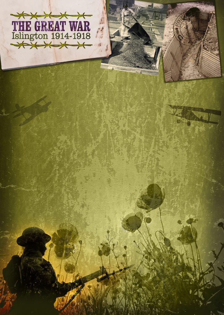
Exhibition panels concept of The Great War for Islington Heritage Centre
See more of my exhibition design on the exhibition and environmental page on my website.
Learn more about the stages in the design process by check out my blog, 13 Key Steps in the Design Process.
To find out how I can help you create atmospheric, eye catching and effective design solutions, call 0775 341 3005 or email info @ iconiccreative.co.uk
Better Photography 101 – Part 3 Depth of Field
Depth of Field
Have you seen photos that are sharp on a person’s face and then blurred just passed them? This is making use of your camera controls to create depth of field (DOF).
The easy definition of depth of field is the area of an image which is in focus.
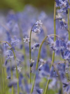
Bluebells in Perivale Wood with shallow depth of field
Shallow Depth of Field
Shallow depth of field is like the bluebells here. If the subject of the photo is sharp, but the surrounding parts of the photo is blurred, particularly very blurred, that is shallow depth of field.
Using shallow depth of field can be used creatively to create atmospheric, romantic and dreamy images, allowing you to direct your viewer’s attention to the area you want them to look at and add evoke emotion.
It also allows to pick one person out of a crowd and focus on them, good when doing documentary or reportage photography, or at a wedding to capture a bride or groom’s emotions.
To obtain a shallow depth of field open up your camera’s aperture (f-stop) – the wider the aperture, the shallower depth of field and the softer the background of your image.
The amount of aperture opening will depend on what lens you are able to use on your DSLR. Basic lenses often open to about f3.5 or f2.5, more expensive ones open to about f1.4.
The drawback is that the more you open your aperture, the more likely you are to get blur due to camera shake in your image, so you need to hold your camera very still (hold your elbows tight against your side and breath out gently before pressing the shutter), balance it on something, a wall, fence or the ground, or put it on a tripod. For the bluebell image above, I was laid horizontally on the ground, with my head tilted almost upside down – yes I suffer for my art 🙂
Deeper Depth of Field
Carnival time!
Deeper depth of field means more of the image is in focus and sharp. In this image I’ve focused on the carnival organiser, but because I was doing reportage coverage for the organisers, I wanted to show some of what what going on in the background, although not in detail.
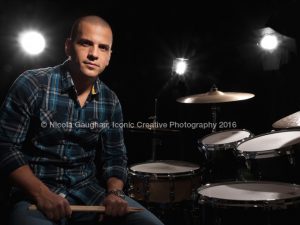
Antoine brought his whole drum kit when he had his photo taken
Using a deeper depth of field means that everything from close to your camera to infinity in your image will be sharper, depending on what setting you use.
To ensure more of your image is sharp close your aperture down (increase the f-stop number). From about f16/f18 is good for this. the smallest aperture is usually f22.
To add creativity to low light/night shots you can even make street or other lamps sparkle, by closing your aperture to it’s smallest opening (usually f22, but more expensive cameras and lenses go further). In this shot of Antoine, I’ve ‘stopped down’ to create light flare on the studio lights to make it look like it was taken on a stage. If you were to shoot things like diamonds (wishful thinking), you could use this technique to to add sparkle to the stones.
Think of it another way
Another way of understanding aperture and depth of field is how much light you’re letting into your camera: the larger the aperture (and the smaller the f-stop), the more light you’re letting into the camera. The small the aperture (and the bigger the f-stop), the less light you’re letting into the camera.
The more light that goes into the camera, the brighter your image, the less light means that your image will be darker. You can then control aspects of that through other tools such as shutter speed and ISO.
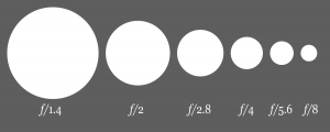
Aperture diagram
This diagram shows some of the f-stops available.
Check out some more examples of shallow and deep depth of field
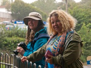
Trip to Torquay with my friends with shallow depth of field
Shallow depth of field
In this photo I’ve picked out my two friends using a fairly shallow depth of field. They are pin sharp as they’re within the zone of focus of the aperture that I have chosen. According to the EXIF data for this image I used an f-top of f5.6, a shutter speed of 1/160th and an ISO setting of 320.
The background is softer and slightly blurred, meaning that all the attention is on my friends. I hadn’t seen the two of them for several years, so this is a lovely reminder for me.
The image below that is of Jo Brianti of JLB Support Solutions. Because Jo is the subject of the portrait I’ve used a shallow depth of field of separate her from the background and focus on her.

Jo Brianti of JLB Support Solution
According to the EXIF data for this image, I used an aperture (f-stop) of f5.0, with a shutter speed of 1/160 and an ISO of 100 (as we were under a canopy and I was using off camera flash and a reflector).
Jo is clear and sharp and the trees are softer and slightly blurred, helping her stand out, therefore enhancing the impact of the portrait.
Deeper depth of field examples
In the next photo, of the Martin Parr exhibition I saw in Paris, I’ve used s deeper depth of field so that even the Eiffel Tower in the distance is sharp. I’ve also utilised diagonals to draw the eye along the photos to the Eiffel tower.
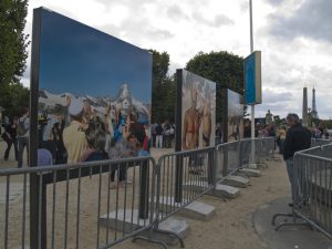
Martin Parr exhibition Paris
I found this an interesting exhibition watching people interacting with the photos, creating even more juxtaposition with the images themselves.
According to the EXIF data I used f8, with s shutter speed of 1/320 and an ISO of 250.
In the last example I again used a deeper depth of field so that all the images and all the people are sharp, as I wanted to see all their responses and include that in the image.
According to the EXIF data I used an f-stop of f8, a shutter speed of 1/160th and and ISO of 250.
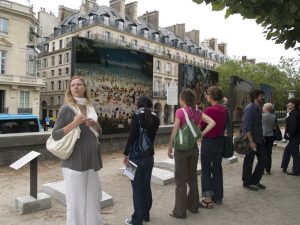
Martin Parr exhibition Paris
Learn why cropping your photos is a great way to improve them.
Check out part 1 of the Better Photography 101 series about your intent behind your photos
Check out some of my previous work at www.iconiccreative.co.uk
To find out how I can help you create atmospheric portraits, or event coverage, call me on 0775 341 3005 or email info@iconiccreative.co.uk
